```{r}
#| include: false
suppressPackageStartupMessages(library(tidyverse))
suppressPackageStartupMessages(library(knitr))
suppressPackageStartupMessages(library(htmltools))
source("R/chapter_table_helpers.R")
```
:::: {.content-visible when-format="html"}
```{webr-r}
#| context: setup
#| include: false
#| echo: false
smallsamplelab_mini_marketing_data <- function() {
data.frame(
id = 1:30,
campaign = rep(c("Email", "Social"), c(15, 15)),
satisfaction = c(5, 4, 4, 4, 5, 4, 2, 3, 5, 4, 4, 2, 5, 3, 4, 4, 3, 3, 4, 3, 3, 4, 3, 4, 3, 1, 4, 3, 4, 3),
age_group = c(
"55+", "35-54", "55+", "35-54", "55+", "18-34", "55+", "18-34", "35-54", "35-54",
"18-34", "55+", "55+", "35-54", "35-54", "18-34", "55+", "55+", "18-34", "35-54",
"35-54", "18-34", "55+", "55+", "55+", "18-34", "55+", "35-54", "35-54", "18-34"
),
prior_purchase = c(
"Yes", "Yes", "No", "Yes", "Yes", "Yes", "No", "Yes", "Yes", "Yes",
"No", "Yes", "No", "Yes", "No", "Yes", "No", "No", "Yes", "No",
"No", "Yes", "No", "No", "Yes", "No", "No", "No", "Yes", "No"
)
)
}
study_data <- smallsamplelab_mini_marketing_data()
smallsamplelab_apa_table <- function(number = NULL, title = NULL, data,
note = NULL,
align = rep("l", ncol(data)),
col.names = names(data),
digits = NULL) {
print(data)
if (!is.null(note)) {
message(note)
}
invisible(data)
}
```
::::
# Chapter 18: Visualising Uncertainty and Presenting Results
### Learning Objectives
By the end of this chapter, you will be able to explain why uncertainty visualisation is central to small-sample reporting, distinguish standard deviations, standard errors and confidence intervals, show individual observations alongside summaries, create clear `ggplot2` figures with uncertainty intervals, identify misleading visual choices, and design figures and tables that support estimation rather than binary significance claims.
### The Role of Visualisation in Small-Sample Research
Visualisation serves multiple purposes:
- **Exploratory**: Identify patterns, outliers, and distributional features during data screening.
- **Diagnostic**: Assess assumptions (normality, linearity, homoscedasticity).
- **Inferential**: Display estimates, confidence intervals, and group comparisons.
- **Communicative**: Convey findings to diverse audiences in accessible formats.
With small samples, visualisation is particularly valuable because individual data points can be shown (unlike large datasets where summaries are necessary). Showing raw data alongside summaries makes the variability and structure of the data visible to the reader.
### Visualising Point Estimates with Confidence Intervals
Error bars (standard errors or confidence intervals) convey uncertainty. Use 95% CIs for inferential plots, as they align with conventional significance testing (CIs that exclude zero correspond to p < 0.05).
**Best practices**:
- Label axes clearly with units.
- Include a legend if multiple groups are compared.
- Use colour or shape to distinguish groups.
- Avoid 3D effects and unnecessary decoration (chart junk).
- Use colour-blind-safe palettes such as `viridis` or carefully chosen ColorBrewer palettes. Do not rely on colour alone. Combine colour with labels, shapes, or direct annotation where possible.
### Example: Bar Plot with Error Bars
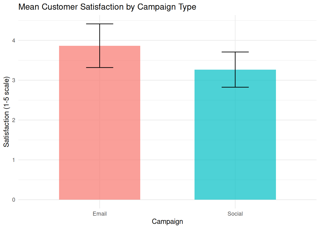
We compare mean satisfaction scores between two campaign types with 95% CI error bars.
:::: {.content-visible when-format="html"}
::::: {.panel-tabset group="part-d-reporting-chapter-16-visualising-uncertainty-and-presenting-results-cell-1"}
#### Rendered Output
```{r}
#| label: qfig-ch18-mean-ci-web
#| fig-cap: "Figure 18.1: Mean customer satisfaction by campaign type with 95% confidence intervals."
#| alt: "Mean customer satisfaction by campaign type with 95% confidence intervals."
#| echo: false
library(tidyverse)
# Load data
study_data <- read_csv("data/mini_marketing.csv", show_col_types = FALSE)
# Compute means and 95% CIs
summary_stats <- study_data %>%
group_by(campaign) %>%
summarise(
mean_satisfaction = mean(satisfaction, na.rm = TRUE),
se = sd(satisfaction, na.rm = TRUE) / sqrt(n()),
t_crit = qt(0.975, df = n() - 1),
ci_lower = mean_satisfaction - t_crit * se,
ci_upper = mean_satisfaction + t_crit * se,
.groups = "drop"
)
# Bar plot with error bars
ggplot(summary_stats, aes(x = campaign, y = mean_satisfaction, fill = campaign)) +
geom_col(width = 0.6, alpha = 0.7) +
geom_errorbar(aes(ymin = ci_lower, ymax = ci_upper), width = 0.2) +
labs(
title = "Mean Customer Satisfaction by Campaign Type",
x = "Campaign",
y = "Satisfaction (1-5 scale)",
fill = "Campaign"
) +
theme_minimal() +
theme(legend.position = "none")
```
#### R Code
```{webr-r}
#| context: interactive
library(dplyr)
library(ggplot2)
library(tidyr)
library(tibble)
library(purrr)
library(readr)
# Load data
study_data <- smallsamplelab_mini_marketing_data()
# Compute means and 95% CIs
summary_stats <- study_data %>%
group_by(campaign) %>%
summarise(
mean_satisfaction = mean(satisfaction, na.rm = TRUE),
se = sd(satisfaction, na.rm = TRUE) / sqrt(n()),
t_crit = qt(0.975, df = n() - 1),
ci_lower = mean_satisfaction - t_crit * se,
ci_upper = mean_satisfaction + t_crit * se,
.groups = "drop"
)
# Bar plot with error bars
ggplot(summary_stats, aes(x = campaign, y = mean_satisfaction, fill = campaign)) +
geom_col(width = 0.6, alpha = 0.7) +
geom_errorbar(aes(ymin = ci_lower, ymax = ci_upper), width = 0.2) +
labs(
title = "Mean Customer Satisfaction by Campaign Type",
x = "Campaign",
y = "Satisfaction (1-5 scale)",
fill = "Campaign"
) +
theme_minimal() +
theme(legend.position = "none")
```
:::::
::::
:::: {.content-visible unless-format="html"}
```{r}
#| label: qfig-ch18-mean-ci
#| fig-cap: "Figure 18.1: Mean customer satisfaction by campaign type with 95% confidence intervals."
#| alt: "Mean customer satisfaction by campaign type with 95% confidence intervals."
library(tidyverse)
# Load data
study_data <- read_csv("data/mini_marketing.csv", show_col_types = FALSE)
# Compute means and 95% CIs
summary_stats <- study_data %>%
group_by(campaign) %>%
summarise(
mean_satisfaction = mean(satisfaction, na.rm = TRUE),
se = sd(satisfaction, na.rm = TRUE) / sqrt(n()),
t_crit = qt(0.975, df = n() - 1),
ci_lower = mean_satisfaction - t_crit * se,
ci_upper = mean_satisfaction + t_crit * se,
.groups = "drop"
)
# Bar plot with error bars
ggplot(summary_stats, aes(x = campaign, y = mean_satisfaction, fill = campaign)) +
geom_col(width = 0.6, alpha = 0.7) +
geom_errorbar(aes(ymin = ci_lower, ymax = ci_upper), width = 0.2) +
labs(
title = "Mean Customer Satisfaction by Campaign Type",
x = "Campaign",
y = "Satisfaction (1-5 scale)",
fill = "Campaign"
) +
theme_minimal() +
theme(legend.position = "none")
```
::::
Interpretation: The bars show mean satisfaction for each campaign, and the error bars show 95% confidence intervals based on the *t* distribution within each group. These intervals describe uncertainty around each group mean. Formal group comparisons should still be reported with the planned statistical test rather than judged only by overlap of the bars.
### Showing Individual Data Points
With small samples (n < 50), individual data points can be overlaid on summary plots. This reveals the distribution, identifies outliers, and shows sample size directly.
### Example: Dot Plot with Mean and CI
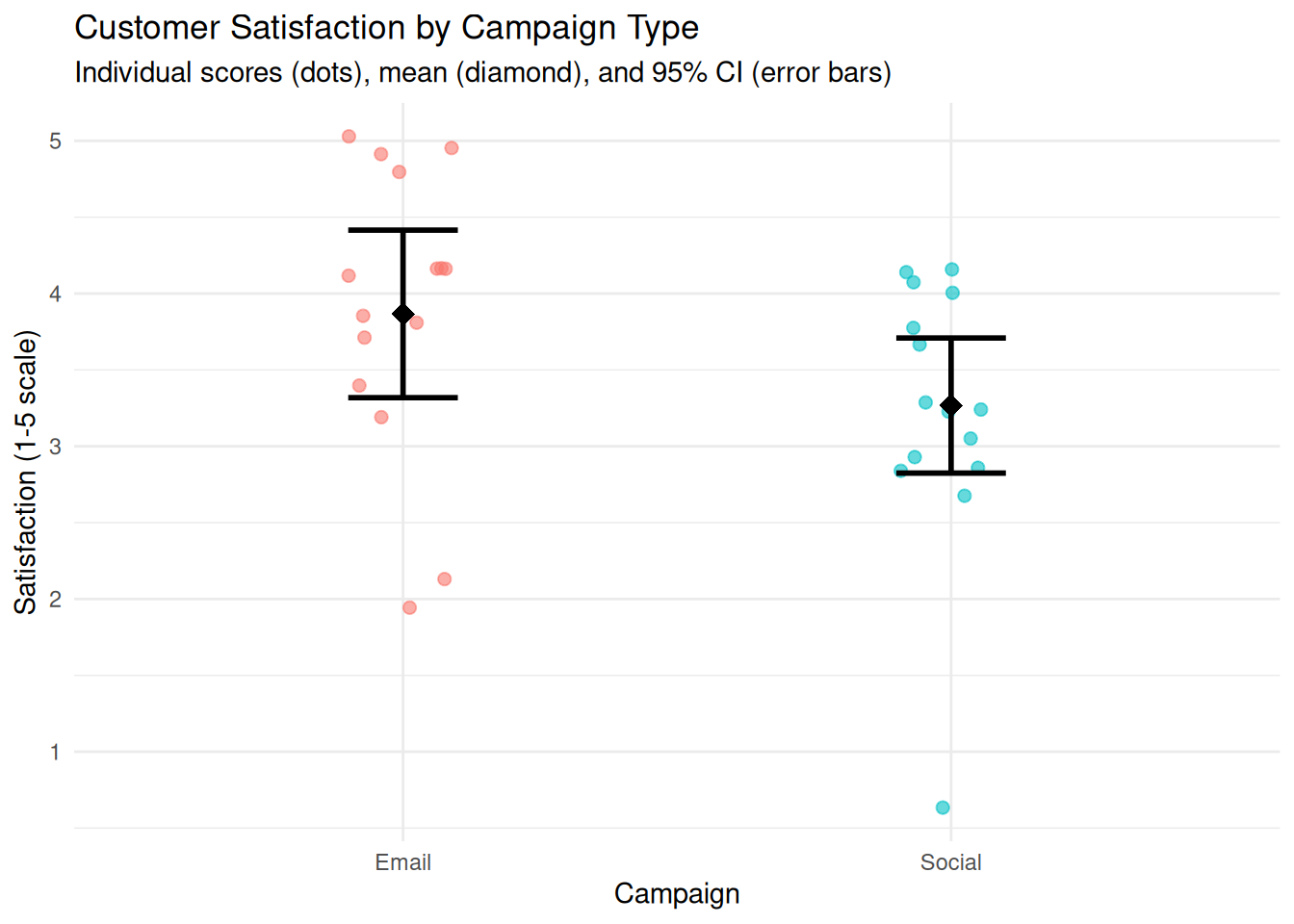
We create a dot plot showing individual satisfaction scores, overlaid with group means and CIs.
:::: {.content-visible when-format="html"}
::::: {.panel-tabset group="part-d-reporting-chapter-16-visualising-uncertainty-and-presenting-results-cell-2"}
#### Rendered Output
```{r}
#| label: qfig-ch18-dot-mean-ci-web
#| fig-cap: "Figure 18.2: Individual satisfaction scores with group means and 95% confidence intervals."
#| alt: "Individual satisfaction scores with group means and 95% confidence intervals."
#| echo: false
library(tidyverse)
study_data <- read_csv("data/mini_marketing.csv", show_col_types = FALSE)
# Compute summary statistics
summary_stats <- study_data %>%
group_by(campaign) %>%
summarise(
mean_satisfaction = mean(satisfaction, na.rm = TRUE),
se = sd(satisfaction, na.rm = TRUE) / sqrt(n()),
t_crit = qt(0.975, df = n() - 1),
ci_lower = mean_satisfaction - t_crit * se,
ci_upper = mean_satisfaction + t_crit * se,
.groups = "drop"
)
# Dot plot with mean and CI
ggplot(study_data, aes(x = campaign, y = satisfaction, colour = campaign)) +
geom_jitter(width = 0.1, alpha = 0.6, size = 2) +
geom_point(data = summary_stats, aes(y = mean_satisfaction),
size = 4, shape = 18, colour = "black") +
geom_errorbar(data = summary_stats, aes(y = mean_satisfaction, ymin = ci_lower, ymax = ci_upper),
width = 0.2, colour = "black", linewidth = 1) +
labs(
title = "Customer Satisfaction by Campaign Type",
subtitle = "Individual scores (dots), mean (diamond), and 95% CI (error bars)",
x = "Campaign",
y = "Satisfaction (1-5 scale)"
) +
theme_minimal() +
theme(legend.position = "none")
```
#### R Code
```{webr-r}
#| context: interactive
library(dplyr)
library(ggplot2)
library(tidyr)
library(tibble)
library(purrr)
library(readr)
study_data <- smallsamplelab_mini_marketing_data()
# Compute summary statistics
summary_stats <- study_data %>%
group_by(campaign) %>%
summarise(
mean_satisfaction = mean(satisfaction, na.rm = TRUE),
se = sd(satisfaction, na.rm = TRUE) / sqrt(n()),
t_crit = qt(0.975, df = n() - 1),
ci_lower = mean_satisfaction - t_crit * se,
ci_upper = mean_satisfaction + t_crit * se,
.groups = "drop"
)
# Dot plot with mean and CI
ggplot(study_data, aes(x = campaign, y = satisfaction, colour = campaign)) +
geom_jitter(width = 0.1, alpha = 0.6, size = 2) +
geom_point(data = summary_stats, aes(y = mean_satisfaction),
size = 4, shape = 18, colour = "black") +
geom_errorbar(data = summary_stats, aes(y = mean_satisfaction, ymin = ci_lower, ymax = ci_upper),
width = 0.2, colour = "black", linewidth = 1) +
labs(
title = "Customer Satisfaction by Campaign Type",
subtitle = "Individual scores (dots), mean (diamond), and 95% CI (error bars)",
x = "Campaign",
y = "Satisfaction (1-5 scale)"
) +
theme_minimal() +
theme(legend.position = "none")
```
:::::
::::
:::: {.content-visible unless-format="html"}
```{r}
#| label: qfig-ch18-dot-mean-ci
#| fig-cap: "Figure 18.2: Individual satisfaction scores with group means and 95% confidence intervals."
#| alt: "Individual satisfaction scores with group means and 95% confidence intervals."
library(tidyverse)
study_data <- read_csv("data/mini_marketing.csv", show_col_types = FALSE)
# Compute summary statistics
summary_stats <- study_data %>%
group_by(campaign) %>%
summarise(
mean_satisfaction = mean(satisfaction, na.rm = TRUE),
se = sd(satisfaction, na.rm = TRUE) / sqrt(n()),
t_crit = qt(0.975, df = n() - 1),
ci_lower = mean_satisfaction - t_crit * se,
ci_upper = mean_satisfaction + t_crit * se,
.groups = "drop"
)
# Dot plot with mean and CI
ggplot(study_data, aes(x = campaign, y = satisfaction, colour = campaign)) +
geom_jitter(width = 0.1, alpha = 0.6, size = 2) +
geom_point(data = summary_stats, aes(y = mean_satisfaction),
size = 4, shape = 18, colour = "black") +
geom_errorbar(data = summary_stats, aes(y = mean_satisfaction, ymin = ci_lower, ymax = ci_upper),
width = 0.2, colour = "black", linewidth = 1) +
labs(
title = "Customer Satisfaction by Campaign Type",
subtitle = "Individual scores (dots), mean (diamond), and 95% CI (error bars)",
x = "Campaign",
y = "Satisfaction (1-5 scale)"
) +
theme_minimal() +
theme(legend.position = "none")
```
::::
Interpretation: Each dot represents one participant. The diamond shows the group mean, and the error bars show the 95% CI. Readers can see the distribution of individual scores, the central tendency, and the precision of the estimate simultaneously.
### Box Plots for Distributional Comparison
Box plots display the median, quartiles, and outliers, providing a non-parametric summary of distribution. They are particularly useful for comparing groups when data are skewed or ordinal.
### Example: Box Plot Comparison
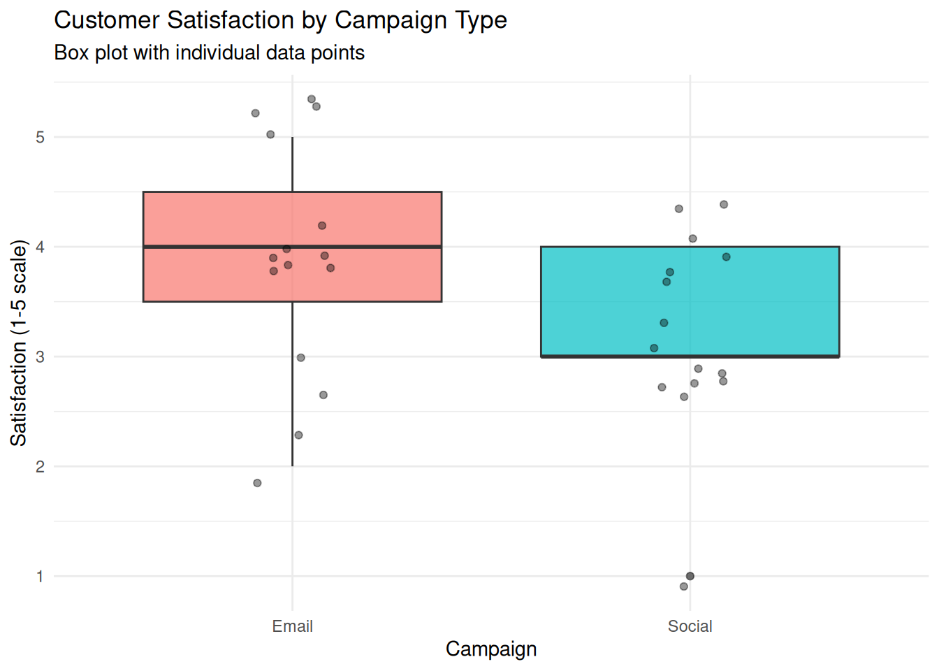
We create a box plot comparing satisfaction scores between campaigns.
:::: {.content-visible when-format="html"}
::::: {.panel-tabset group="part-d-reporting-chapter-16-visualising-uncertainty-and-presenting-results-cell-3"}
#### Rendered Output
```{r}
#| label: qfig-ch18-boxplot-web
#| fig-cap: "Figure 18.3: Box plot comparing customer satisfaction across campaign types."
#| alt: "Box plot comparing customer satisfaction across campaign types."
#| echo: false
library(tidyverse)
study_data <- read_csv("data/mini_marketing.csv", show_col_types = FALSE)
ggplot(study_data, aes(x = campaign, y = satisfaction, fill = campaign)) +
geom_boxplot(alpha = 0.7) +
geom_jitter(width = 0.1, alpha = 0.4) +
labs(
title = "Customer Satisfaction by Campaign Type",
subtitle = "Box plot with individual data points",
x = "Campaign",
y = "Satisfaction (1-5 scale)"
) +
theme_minimal() +
theme(legend.position = "none")
```
#### R Code
```{webr-r}
#| context: interactive
library(dplyr)
library(ggplot2)
library(tidyr)
library(tibble)
library(purrr)
library(readr)
study_data <- smallsamplelab_mini_marketing_data()
ggplot(study_data, aes(x = campaign, y = satisfaction, fill = campaign)) +
geom_boxplot(alpha = 0.7) +
geom_jitter(width = 0.1, alpha = 0.4) +
labs(
title = "Customer Satisfaction by Campaign Type",
subtitle = "Box plot with individual data points",
x = "Campaign",
y = "Satisfaction (1-5 scale)"
) +
theme_minimal() +
theme(legend.position = "none")
```
:::::
::::
:::: {.content-visible unless-format="html"}
```{r}
#| label: qfig-ch18-boxplot
#| fig-cap: "Figure 18.3: Box plot comparing customer satisfaction across campaign types."
#| alt: "Box plot comparing customer satisfaction across campaign types."
library(tidyverse)
study_data <- read_csv("data/mini_marketing.csv", show_col_types = FALSE)
ggplot(study_data, aes(x = campaign, y = satisfaction, fill = campaign)) +
geom_boxplot(alpha = 0.7) +
geom_jitter(width = 0.1, alpha = 0.4) +
labs(
title = "Customer Satisfaction by Campaign Type",
subtitle = "Box plot with individual data points",
x = "Campaign",
y = "Satisfaction (1-5 scale)"
) +
theme_minimal() +
theme(legend.position = "none")
```
::::
Interpretation: The box shows the interquartile range (IQR) with the median as a line inside. Whiskers extend to 1.5 × IQR, and points beyond are potential outliers. Overlaying individual points shows sample size and exact values. This plot is ideal for nonparametric comparisons, such as the Mann–Whitney U test.
### Visualising Regression Results
For regression models, plot predicted values with confidence bands, and overlay observed data. This shows model fit, uncertainty, and deviations.
### Example: Scatterplot with Regression Line and CI Band
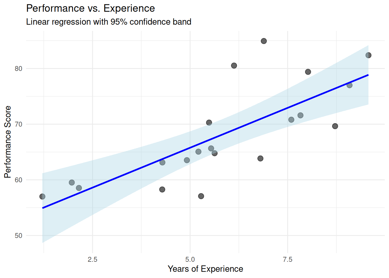
We fit a linear regression (performance ~ experience) and plot the results.
:::: {.content-visible when-format="html"}
::::: {.panel-tabset group="part-d-reporting-chapter-16-visualising-uncertainty-and-presenting-results-cell-4"}
#### Rendered Output
```{r}
#| label: qfig-ch18-regression-web
#| fig-cap: "Figure 18.4: Linear regression of performance on experience with 95% confidence band."
#| alt: "Linear regression of performance on experience with 95% confidence band."
#| echo: false
library(tidyverse)
set.seed(2025)
# Simulated data
reg_data <- tibble(
experience = runif(20, 1, 10),
performance = 50 + 3 * experience + rnorm(20, 0, 5)
)
# Fit model
model <- lm(performance ~ experience, data = reg_data)
# Plot with regression line and CI band
ggplot(reg_data, aes(x = experience, y = performance)) +
geom_point(size = 3, alpha = 0.6) +
geom_smooth(method = "lm", se = TRUE, colour = "blue", fill = "lightblue") +
labs(
title = "Performance vs. Experience",
subtitle = "Linear regression with 95% confidence band",
x = "Years of Experience",
y = "Performance Score"
) +
theme_minimal()
```
#### R Code
```{webr-r}
#| context: interactive
library(dplyr)
library(ggplot2)
library(tidyr)
library(tibble)
library(purrr)
library(readr)
set.seed(2025)
# Simulated data
reg_data <- tibble(
experience = runif(20, 1, 10),
performance = 50 + 3 * experience + rnorm(20, 0, 5)
)
# Fit model
model <- lm(performance ~ experience, data = reg_data)
# Plot with regression line and CI band
ggplot(reg_data, aes(x = experience, y = performance)) +
geom_point(size = 3, alpha = 0.6) +
geom_smooth(method = "lm", se = TRUE, colour = "blue", fill = "lightblue") +
labs(
title = "Performance vs. Experience",
subtitle = "Linear regression with 95% confidence band",
x = "Years of Experience",
y = "Performance Score"
) +
theme_minimal()
```
:::::
::::
:::: {.content-visible unless-format="html"}
```{r}
#| label: qfig-ch18-regression
#| fig-cap: "Figure 18.4: Linear regression of performance on experience with 95% confidence band."
#| alt: "Linear regression of performance on experience with 95% confidence band."
library(tidyverse)
set.seed(2025)
# Simulated data
reg_data <- tibble(
experience = runif(20, 1, 10),
performance = 50 + 3 * experience + rnorm(20, 0, 5)
)
# Fit model
model <- lm(performance ~ experience, data = reg_data)
# Plot with regression line and CI band
ggplot(reg_data, aes(x = experience, y = performance)) +
geom_point(size = 3, alpha = 0.6) +
geom_smooth(method = "lm", se = TRUE, colour = "blue", fill = "lightblue") +
labs(
title = "Performance vs. Experience",
subtitle = "Linear regression with 95% confidence band",
x = "Years of Experience",
y = "Performance Score"
) +
theme_minimal()
```
::::
Interpretation: Each point is an observed case. The blue line is the fitted regression line. The shaded band is the 95% confidence interval for the predicted mean at each value of experience. The band widens at the extremes (where data are sparse), reflecting greater uncertainty. This visualisation shows model fit, precision, and individual deviations simultaneously.
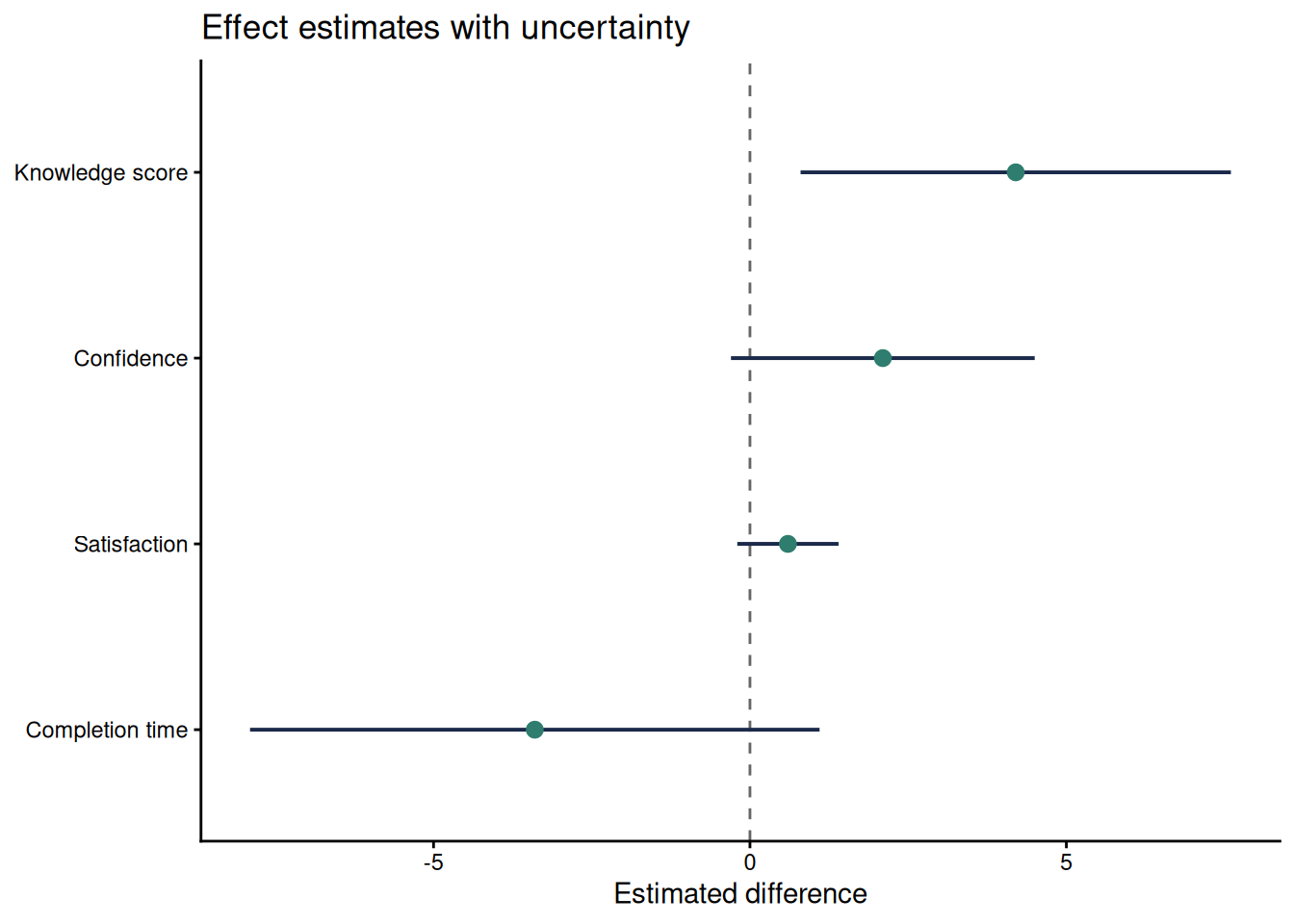
### Forest Plots for Several Estimates
When a report compares several estimates, a forest plot is often clearer than several separate tables. The plot should show the point estimate, the confidence interval, and a reference line such as zero for mean differences or one for ratios. This format works well for multiple outcomes, subgroup estimates, or sensitivity analyses.
```{r}
#| label: qfig-ch18-forest
#| fig-cap: "Figure 18.5: Forest plot of four small-sample estimates with 95% confidence intervals."
#| alt: "Forest plot of four small-sample estimates with 95% confidence intervals."
#| echo: false
forest_data <- tibble(
Outcome = factor(
c("Knowledge score", "Confidence", "Satisfaction", "Completion time"),
levels = rev(c("Knowledge score", "Confidence", "Satisfaction", "Completion time"))
),
Estimate = c(4.2, 2.1, 0.6, -3.4),
Lower = c(0.8, -0.3, -0.2, -7.9),
Upper = c(7.6, 4.5, 1.4, 1.1)
)
ggplot(forest_data, aes(x = Estimate, y = Outcome)) +
geom_vline(xintercept = 0, colour = "#666666", linetype = "dashed") +
geom_segment(aes(x = Lower, xend = Upper, yend = Outcome), colour = "#1B2A4A", linewidth = 0.7) +
geom_point(size = 2.6, colour = "#2E7D6E") +
labs(
x = "Estimated difference",
y = NULL,
title = "Effect estimates with uncertainty"
) +
theme_classic(base_size = 11)
```
Interpretation: The forest plot makes precision visible. The knowledge-score interval stays above zero, while the other intervals include zero or values close to it. This does not make the other estimates unimportant. It shows that the small sample leaves more uncertainty about their direction or practical importance.
### Raincloud and Half-Eye Plots
Raincloud or half-eye plots combine the raw observations, a distribution summary and an interval display. They are useful when a small sample is large enough to show distributional shape but small enough that individual observations should remain visible. The `ggdist` package provides a compact implementation. Because it is an optional visualisation package, the example below is shown as a template.
```{r}
#| eval: false
#| label: ch18-raincloud-template
library(ggdist)

ggplot(study_data, aes(x = satisfaction, y = campaign, fill = campaign)) +
  ggdist::stat_halfeye(adjust = 0.8, width = 0.55, alpha = 0.6) +
  geom_jitter(height = 0.08, width = 0, alpha = 0.6, size = 1.8) +
  stat_summary(fun = median, geom = "point", shape = 23, size = 2.6, fill = "white") +
  scale_fill_viridis_d(option = "C", end = 0.8) +
  labs(x = "Satisfaction (1-5 scale)", y = "Campaign") +
  theme_classic(base_size = 11) +
  theme(legend.position = "none")
```
### Presenting Results in Tables
Tables complement figures by providing exact values. For small samples, consider showing:
- Sample sizes (n per group).
- Means and standard deviations (or medians and IQRs).
- Effect sizes and confidence intervals.
- Test statistics and p-values.
Use simple publication tables with clear labels, sample sizes and notes that explain the inferential method.
For publication tables, align text columns left and numeric columns right, use a consistent number of decimal places within a column, and put method details in notes rather than in crowded column headings. Report exact sample sizes, avoid unnecessary trailing precision, and state whether intervals are exact, bootstrap, model-based or rank-based. If a table mixes estimates with different scales, use separate sections or clear row labels so readers do not compare incompatible numbers.
### Example: Results Summary Table
We create a summary table for the campaign comparison.
:::: {.content-visible when-format="html"}
::::: {.panel-tabset group="part-d-reporting-chapter-16-visualising-uncertainty-and-presenting-results-cell-5"}
#### Rendered Output
```{r}
#| label: tbl-ch18-campaign-summary-web
#| echo: false
library(tidyverse)
study_data <- read_csv("data/mini_marketing.csv", show_col_types = FALSE)
# Summary statistics
summary_table <- study_data %>%
group_by(campaign) %>%
summarise(
N = n(),
Mean = round(mean(satisfaction, na.rm = TRUE), 2),
SD = round(sd(satisfaction, na.rm = TRUE), 2),
Median = median(satisfaction, na.rm = TRUE),
.groups = "drop"
)
# Mann–Whitney test
mw_result <- wilcox.test(satisfaction ~ campaign, data = study_data, exact = FALSE)
p_value <- mw_result$p.value
test_note <- if (p_value < 0.001) {
"Mann–Whitney rank-sum test: p < 0.001."
} else {
sprintf("Mann–Whitney rank-sum test: p = %.3f.", p_value)
}
smallsamplelab_apa_table(
"18.1",
"Summary statistics and Mann–Whitney test for campaign satisfaction",
summary_table,
note = test_note,
align = c("l", "r", "r", "r", "r")
)
```
#### R Code
```{webr-r}
#| context: interactive
library(dplyr)
library(ggplot2)
library(tidyr)
library(tibble)
library(purrr)
library(readr)
study_data <- smallsamplelab_mini_marketing_data()
# Summary statistics
summary_table <- study_data %>%
group_by(campaign) %>%
summarise(
N = n(),
Mean = round(mean(satisfaction, na.rm = TRUE), 2),
SD = round(sd(satisfaction, na.rm = TRUE), 2),
Median = median(satisfaction, na.rm = TRUE),
.groups = "drop"
)
# Mann–Whitney test
mw_result <- wilcox.test(satisfaction ~ campaign, data = study_data, exact = FALSE)
p_value <- mw_result$p.value
test_note <- if (p_value < 0.001) {
"Mann–Whitney rank-sum test: p < 0.001."
} else {
sprintf("Mann–Whitney rank-sum test: p = %.3f.", p_value)
}
smallsamplelab_apa_table(
"18.1",
"Summary statistics and Mann–Whitney test for campaign satisfaction",
summary_table,
note = test_note,
align = c("l", "r", "r", "r", "r")
)
```
:::::
::::
:::: {.content-visible unless-format="html"}
```{r}
#| label: tbl-ch18-campaign-summary
library(tidyverse)
study_data <- read_csv("data/mini_marketing.csv", show_col_types = FALSE)
# Summary statistics
summary_table <- study_data %>%
group_by(campaign) %>%
summarise(
N = n(),
Mean = round(mean(satisfaction, na.rm = TRUE), 2),
SD = round(sd(satisfaction, na.rm = TRUE), 2),
Median = median(satisfaction, na.rm = TRUE),
.groups = "drop"
)
# Mann–Whitney test
mw_result <- wilcox.test(satisfaction ~ campaign, data = study_data, exact = FALSE)
p_value <- mw_result$p.value
test_note <- if (p_value < 0.001) {
"Mann–Whitney rank-sum test: p < 0.001."
} else {
sprintf("Mann–Whitney rank-sum test: p = %.3f.", p_value)
}
smallsamplelab_apa_table(
"18.1",
"Summary statistics and Mann–Whitney test for campaign satisfaction",
summary_table,
note = test_note,
align = c("l", "r", "r", "r", "r")
)
```
::::
Interpretation: The table provides exact summary statistics for each group. Readers can see sample sizes, central tendency, and variability. The p-value from the Mann–Whitney test is reported in the subtitle or a footnote. Tables and figures together provide a complete, accessible presentation of results.
### Avoiding Misleading Visualisations
Common pitfalls:
- **Suppressed zero on the y-axis**: Exaggerates differences. Use a zero baseline unless there is good reason not to (and explain the choice).
- **3D effects and unnecessary decoration**: Distract from data and can obscure values.
- **Dual axes with different scales**: Misleading comparisons. Avoid or use with extreme caution.
- **Overplotting without jitter or transparency**: Hides overlapping points. Use jitter, transparency, or both.
### Key Takeaways
Small-sample figures should show uncertainty and, whenever feasible, the individual observations behind the summary. Point estimates should be paired with confidence intervals, box plots and dot plots should reveal distributional features, and regression figures should show both fitted trends and uncertainty bands. Tables remain necessary because they provide exact sample sizes, estimates, intervals and test results. The central principle is transparency: avoid suppressed axes, 3D effects, dual axes and other design choices that make modest evidence appear stronger than it is.
### Self-Assessment Quiz
```{r}
#| echo: false
#| results: asis
source(normalizePath(file.path(dirname(knitr::current_input(dir = TRUE)), "..", "R", "quiz_helpers.R"), mustWork = TRUE))
smallsamplelab_render_quiz(list(
list(
prompt = "Why is visualisation particularly valuable in small-sample research?",
options = c("Large datasets cannot be visualized", "Individual data points can be shown alongside summaries, revealing variability and building trust", "Visualisation eliminates the need for statistical tests", "Small samples require 3D plots"),
answer = 2L,
explanation = "Small samples make it practical to show individual observations alongside summaries. This lets readers see variability, outliers and sample size directly rather than relying only on means or p-values."
),
list(
prompt = "What do 95% confidence interval error bars represent?",
options = c("The range containing all data points", "The uncertainty around a point estimate", "The standard deviation", "The sample size"),
answer = 2L,
explanation = "Confidence intervals show uncertainty around an estimate, such as a mean, difference, rate or regression coefficient."
),
list(
prompt = "What is the advantage of overlaying individual data points on summary plots (means or medians)?",
options = c("It makes the plot more colourful", "It reveals the distribution, identifies outliers, and shows sample size directly", "It is required by journal guidelines", "It eliminates the need for error bars"),
answer = 2L,
explanation = "Showing raw data reveals patterns that summary statistics alone can hide, including skewness, ties, clusters and influential observations."
),
list(
prompt = "In a regression plot with a confidence band, why does the band typically widen at the extremes?",
options = c("It is a plotting error", "The band widens where data are sparse, reflecting greater uncertainty in predictions", "The confidence band is always the same width", "It indicates the sample size"),
answer = 2L,
explanation = "Confidence bands usually widen where there are fewer observations to constrain the model, often near the edges of the predictor range."
),
list(
prompt = "What information does a box plot display?",
options = c("Only the mean", "The median, quartiles (IQR), and outliers", "Individual data points only", "The correlation coefficient"),
answer = 2L,
explanation = "A box plot shows the interquartile range, the median and potential outliers. It is a compact non-parametric summary of a distribution."
),
list(
prompt = "Why should suppressed zero on the y-axis be avoided (or used with caution)?",
options = c("It saves space", "It can exaggerate differences and mislead readers about the magnitude of effects", "It is required by statistical standards", "It improves visual appeal"),
answer = 2L,
explanation = "Starting an axis above zero can make small differences appear larger than they are. If a truncated axis is necessary, the reason should be stated clearly."
),
list(
prompt = "What is \"chart junk\"?",
options = c("High-quality graphics", "Unnecessary decoration (3D effects, excessive colors, ornaments) that distracts from data", "Statistical error bars", "Individual data points"),
answer = 2L,
explanation = "Chart junk refers to non-data elements that reduce clarity, such as unnecessary 3D effects, excessive colour or decorative elements."
),
list(
prompt = "When creating results tables, what essential information should be included?",
options = c("Only p-values", "Sample sizes, means/medians, measures of variability (SD or IQR), confidence intervals, and test results", "Only the mean values", "Just the hypothesis"),
answer = 2L,
explanation = "Complete tables report sample size, central tendency, variability, effect size, interval estimates and the planned test result so readers can assess both statistical and practical importance."
),
list(
prompt = "What does jittering accomplish in plots with many overlapping points?",
options = c("It removes outliers", "It adds small random offsets to points to reveal overlapping observations", "It changes the statistical significance", "It increases sample size"),
answer = 2L,
explanation = "Jittering adds small random offsets to points so overlapping observations become visible."
),
list(
prompt = "In the dot plot example showing satisfaction scores, what does the diamond symbol represent?",
options = c("An outlier", "The group mean", "A missing value", "The maximum value"),
answer = 2L,
explanation = "The diamond marks the group mean, while the smaller dots show individual observations. Different symbols help distinguish summaries from raw data."
)
))
```