```{r}
#| include: false
suppressPackageStartupMessages(library(tidyverse))
suppressPackageStartupMessages(library(knitr))
suppressPackageStartupMessages(library(htmltools))
source(normalizePath(file.path(dirname(knitr::current_input(dir = TRUE)), "..", "R", "chapter_table_helpers.R"), mustWork = TRUE))
```
:::: {.content-visible when-format="html"}
```{webr-r}
#| context: setup
#| include: false
#| echo: false
smallsamplelab_apa_table <- function(number, caption, data, note = NULL, align = NULL, ...) {
print(data)
if (!is.null(note)) message(note)
invisible(data)
}
```
::::
# Chapter 9: Assessing Multiple Imputation Quality
### Learning Objectives
By the end of this chapter, you will be able to explain why multiple-imputation diagnostics matter, inspect the main convergence and plausibility checks produced by `mice`, evaluate whether pooled estimates are stable across different values of `m`, and report imputation diagnostics in a way that makes downstream analyses defensible.
### Why Imputation Diagnostics Matter
Multiple imputation (MI) requires deliberate specification at each stage. The quality of the imputed values depends on whether the imputation models are specified sensibly, whether the chained equations have converged, whether the imputed values remain plausible relative to the observed data, and whether the pooled estimates are stable across different choices of `m`. If those checks are ignored, the result can be biased parameter estimates, incorrect standard errors, implausible imputations, and misplaced confidence in apparently polished output.
### Diagnostic 1: Convergence Checks
The `mice` algorithm uses **iterative chained equations**: it cycles through variables, updating imputations based on the current values of other variables. Convergence occurs when these iterations stabilise (no systematic trends).
#### Trace Plots
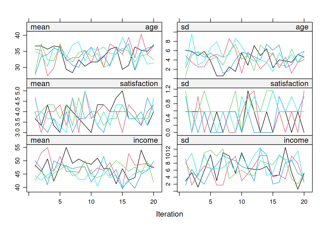
Trace plots show the mean and SD of imputed values across iterations for each variable. Good convergence looks like a fuzzy caterpillar: trace lines fluctuate randomly around a stable mean, show no systematic upward or downward trend across iterations, and chains from different imputations intermingle rather than remaining separated. Figure 9.1 shows the full set of trace plots for the three simulated variables.
:::: {.content-visible when-format="html"}
::::: {.panel-tabset group="part-b-data-collection-chapter-12-5-assessing-multiple-imputation-quality-cell-1"}
#### Rendered Output
```{r}
#| label: part-b-mi-diag-1-html
#| fig-cap: "Figure 9.1: Trace plots for age, satisfaction, and income across imputations."
#| alt: "Trace plots for age, satisfaction, and income across imputations."
#| echo: false
library(mice)
library(tidyverse)
# Simulate data with missing values
set.seed(2025)
mi_data <- tibble(
age = c(25, 32, NA, 45, 29, NA, 38, 41, 27, 35, NA, 42, 30, 28, 39),
satisfaction = c(4, 5, 3, NA, 4, 5, NA, 4, 5, 3, 4, NA, 5, 4, 3),
income = c(35, 50, 42, 60, NA, 55, 48, NA, 40, 52, 45, 58, NA, 38, 49)
)
# Multiple imputation with more iterations to demonstrate convergence
imp <- mice(mi_data, m = 5, maxit = 20, seed = 2025, print = FALSE)
# Plot trace lines for all variables
plot(imp, c("age", "satisfaction", "income"))
```
#### Cell Code
```{webr-r}
#| context: interactive
#| label: part-b-mi-diag-1
#| fig-cap: "Figure 9.1: Trace plots for age, satisfaction, and income across imputations."
library(mice)
library(dplyr)
library(ggplot2)
library(purrr)
library(tibble)
library(tidyr)
# Simulate data with missing values
set.seed(2025)
mi_data <- tibble(
age = c(25, 32, NA, 45, 29, NA, 38, 41, 27, 35, NA, 42, 30, 28, 39),
satisfaction = c(4, 5, 3, NA, 4, 5, NA, 4, 5, 3, 4, NA, 5, 4, 3),
income = c(35, 50, 42, 60, NA, 55, 48, NA, 40, 52, 45, 58, NA, 38, 49)
)
# Multiple imputation with more iterations to demonstrate convergence
imp <- mice(mi_data, m = 5, maxit = 20, seed = 2025, print = FALSE)
# Plot trace lines for all variables
plot(imp, c("age", "satisfaction", "income"))
```
:::::
::::
:::: {.content-visible unless-format="html"}
```{r}
#| label: part-b-mi-diag-1
#| fig-cap: "Figure 9.1: Trace plots for age, satisfaction, and income across imputations."
#| alt: "Trace plots for age, satisfaction, and income across imputations."
library(mice)
library(tidyverse)
# Simulate data with missing values
set.seed(2025)
mi_data <- tibble(
age = c(25, 32, NA, 45, 29, NA, 38, 41, 27, 35, NA, 42, 30, 28, 39),
satisfaction = c(4, 5, 3, NA, 4, 5, NA, 4, 5, 3, 4, NA, 5, 4, 3),
income = c(35, 50, 42, 60, NA, 55, 48, NA, 40, 52, 45, 58, NA, 38, 49)
)
# Multiple imputation with more iterations to demonstrate convergence
imp <- mice(mi_data, m = 5, maxit = 20, seed = 2025, print = FALSE)
# Plot trace lines for all variables
plot(imp, c("age", "satisfaction", "income"))
```
::::
**Interpretation**: Figure 9.1 should resemble a fuzzy caterpillar rather than a drifting set of lines. If the traces still drift after roughly 20 iterations, increase `maxit`. If chains remain separated, inspect the imputation model specification rather than assuming convergence has occurred.
#### Checking Specific Variables
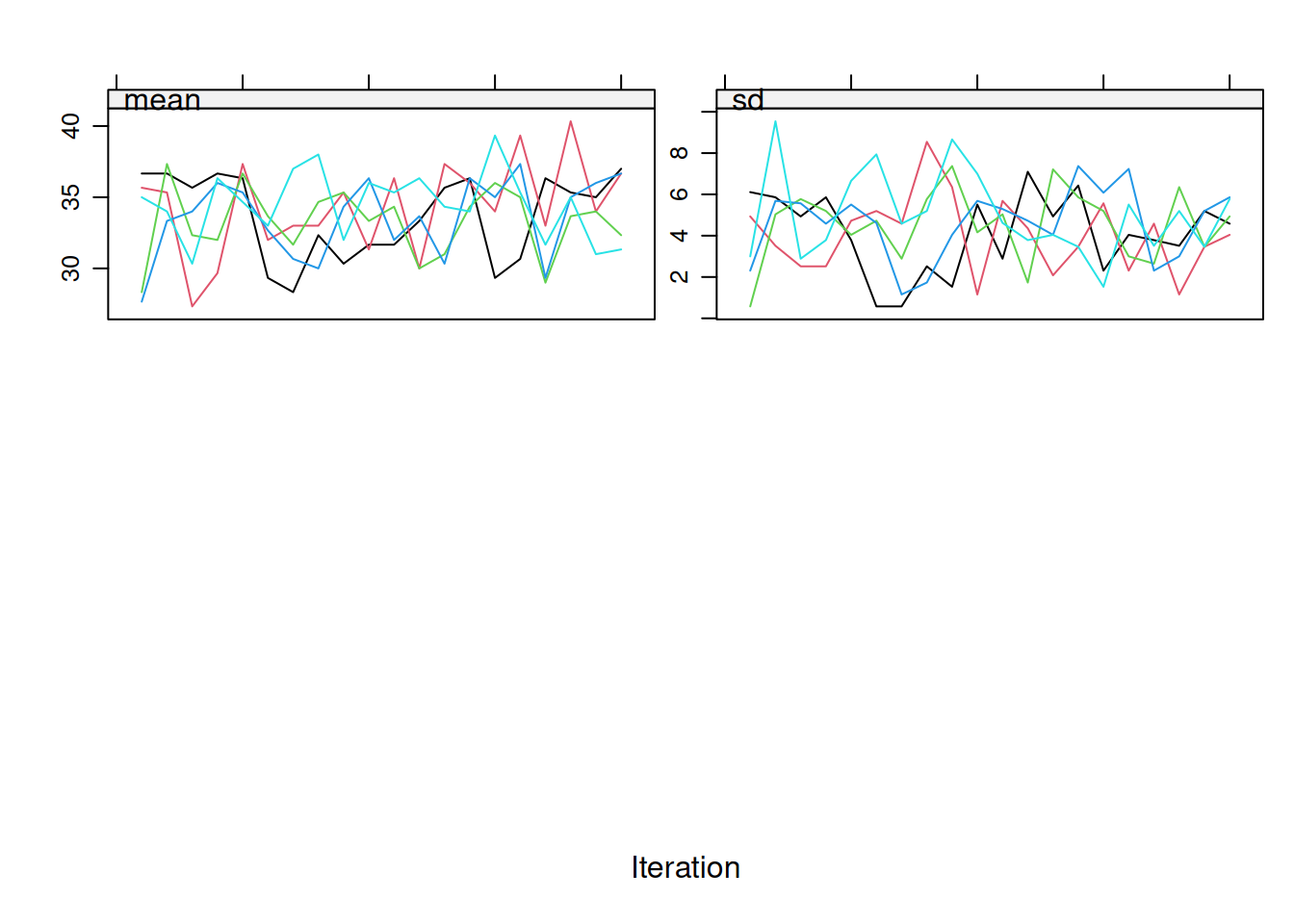
If you have many variables, focus on those with the most missingness. Figure 9.2 shows how that targeted check looks when attention is restricted to `age`.
:::: {.content-visible when-format="html"}
::::: {.panel-tabset group="part-b-data-collection-chapter-12-5-assessing-multiple-imputation-quality-cell-2"}
#### Rendered Output
```{r}
#| label: part-b-mi-diag-2-html
#| fig-cap: "Figure 9.2: Trace plot for age only."
#| alt: "Trace plot for age only."
#| echo: false
# Focus on specific variables with high missingness
plot(imp, "age")
```
#### Cell Code
```{webr-r}
#| context: interactive
#| label: part-b-mi-diag-2
#| fig-cap: "Figure 9.2: Trace plot for age only."
# Focus on specific variables with high missingness
plot(imp, "age")
```
:::::
::::
:::: {.content-visible unless-format="html"}
```{r}
#| label: part-b-mi-diag-2
#| fig-cap: "Figure 9.2: Trace plot for age only."
#| alt: "Trace plot for age only."
# Focus on specific variables with high missingness
plot(imp, "age")
```
::::
If you still see clear trends after the first 10 to 20 iterations, increase `maxit` to 50 or even 100. In many routine MCAR or MAR settings, `maxit = 20–50` is usually enough, but the diagnostics should drive that decision rather than a hard default.
### Diagnostic 2: Imputed vs. Observed Distributions
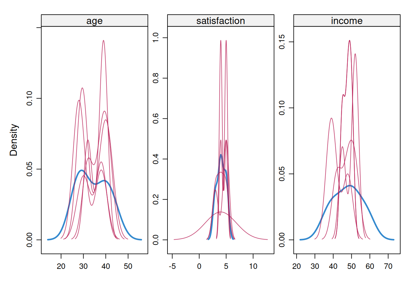
Imputed values should **resemble** the observed data distribution (but not be identical). Large discrepancies suggest model misspecification. With n < 30, imputed distributions may appear jagged or narrower because predictive mean matching has few donor values. Focus on whether imputed values fall within a plausible observed range rather than demanding smooth density curves. Figure 9.3 shows the density comparison for the simulated example.
#### Density Plots
:::: {.content-visible when-format="html"}
::::: {.panel-tabset group="part-b-data-collection-chapter-12-5-assessing-multiple-imputation-quality-cell-3"}
#### Rendered Output
```{r}
#| label: part-b-mi-diag-3-html
#| fig-cap: "Figure 9.3: Observed and imputed density plots for the simulated example."
#| alt: "Observed and imputed density plots for the simulated example."
#| echo: false
# Compare density plots: blue = observed, red = imputed
densityplot(imp)
```
#### Cell Code
```{webr-r}
#| context: interactive
#| label: part-b-mi-diag-3
#| fig-cap: "Figure 9.3: Observed and imputed density plots for the simulated example."
# Compare density plots: blue = observed, red = imputed
densityplot(imp)
```
:::::
::::
:::: {.content-visible unless-format="html"}
```{r}
#| label: part-b-mi-diag-3
#| fig-cap: "Figure 9.3: Observed and imputed density plots for the simulated example."
#| alt: "Observed and imputed density plots for the simulated example."
# Compare density plots: blue = observed, red = imputed
densityplot(imp)
```
::::
**Interpretation**: Figure 9.3 should show substantial overlap between observed and imputed distributions without making them identical. In very small examples the red curve can look more jagged or narrower because it is based on few imputed values. The red flags are collapse toward a single implausible value or a clear shift outside the observed range.
#### Strip Plots (Univariate)
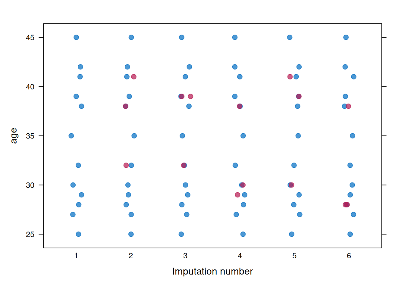
Strip plots show individual imputed values (red) alongside observed values (blue). Figure 9.4 uses `age` as the example variable.
:::: {.content-visible when-format="html"}
::::: {.panel-tabset group="part-b-data-collection-chapter-12-5-assessing-multiple-imputation-quality-cell-4"}
#### Rendered Output
```{r}
#| label: part-b-mi-diag-4-html
#| fig-cap: "Figure 9.4: Strip plot for age across imputations."
#| alt: "Strip plot for age across imputations."
#| echo: false
# Strip plots for each variable
stripplot(imp, age ~ .imp, pch = 20, cex = 1.5)
```
#### Cell Code
```{webr-r}
#| context: interactive
#| label: part-b-mi-diag-4
#| fig-cap: "Figure 9.4: Strip plot for age across imputations."
# Strip plots for each variable
stripplot(imp, age ~ .imp, pch = 20, cex = 1.5)
```
:::::
::::
:::: {.content-visible unless-format="html"}
```{r}
#| label: part-b-mi-diag-4
#| fig-cap: "Figure 9.4: Strip plot for age across imputations."
#| alt: "Strip plot for age across imputations."
# Strip plots for each variable
stripplot(imp, age ~ .imp, pch = 20, cex = 1.5)
```
::::
**Interpretation**: Figure 9.4 should show the imputed values filling gaps in the observed data without behaving like a separate distribution. A useful question here is whether any imputed points fall implausibly far outside the observed range, because that usually signals a poor imputation model rather than legitimate uncertainty.
### Diagnostic 3: Sensitivity to m (Number of Imputations)
The number of imputations (m) affects the precision of pooled estimates. With more imputations, pooled estimates become more stable and standard errors more accurate. Table 9.1 compares the coefficient and standard-error estimates across three values of `m`.
#### Rule of Thumb for m
The number of imputations should increase as the fraction of missing information (FMI) increases. When FMI is below about 10%, `m = 5` to `10` is often adequate. When FMI is around 10% to 30%, `m = 20` to `50` is more defensible. When FMI exceeds 30%, values such as `m = 50` to `100` may be needed. A useful heuristic from White, Royston, and Wood (2011) [@white2011] is $m \geq 100 \times \text{FMI}$, where FMI is averaged across the parameters that matter for the analysis. For example, average FMI = 0.15 suggests at least 15 imputations, and average FMI = 0.30 suggests at least 30. Round up to convenient reporting values such as `m = 20` or `m = 50`.
#### Testing Sensitivity
:::: {.content-visible when-format="html"}
::::: {.panel-tabset group="part-b-data-collection-chapter-12-5-assessing-multiple-imputation-quality-cell-5"}
#### Rendered Output
```{r}
#| label: part-b-mi-diag-5-html
#| echo: false
# Simulate larger dataset for demonstration
set.seed(2025)
age_base <- round(rnorm(50, mean = 38, sd = 10))
age_vals50 <- pmax(20L, pmin(60L, age_base))
income_vals <- round(25 + 0.5 * age_vals50 + rnorm(50, 0, 8))
sat_cont <- 1 + 0.04 * income_vals + rnorm(50, 0, 0.8)
sat_vals <- pmin(5L, pmax(1L, round(sat_cont)))
# MAR: satisfaction missing for higher-age participants
miss_prob50 <- plogis((age_vals50 - 42) / 8)
sat_obs <- ifelse(runif(50) < miss_prob50 * 0.4, NA_real_, sat_vals)
# Small MCAR fraction on age and income for realistic imputation demo
age_obs <- ifelse(runif(50) < 0.10, NA_real_, age_vals50)
income_obs <- ifelse(runif(50) < 0.06, NA_real_, income_vals)
mi_data_large <- tibble(
age = age_obs,
income = income_obs,
satisfaction = sat_obs
)
# Impute with varying m
imp_m5 <- mice(mi_data_large, m = 5, maxit = 20, seed = 2025, print = FALSE)
imp_m20 <- mice(mi_data_large, m = 20, maxit = 20, seed = 2025, print = FALSE)
imp_m50 <- mice(mi_data_large, m = 50, maxit = 20, seed = 2025, print = FALSE)
# Fit model and pool results
fit_m5 <- with(imp_m5, lm(satisfaction ~ age + income))
fit_m20 <- with(imp_m20, lm(satisfaction ~ age + income))
fit_m50 <- with(imp_m50, lm(satisfaction ~ age + income))
pooled_m5 <- pool(fit_m5)
pooled_m20 <- pool(fit_m20)
pooled_m50 <- pool(fit_m50)
# Compare coefficient estimates and SEs
compare_m <- tibble(
m = c(5, 20, 50),
age_coef = c(
summary(pooled_m5)$estimate[2],
summary(pooled_m20)$estimate[2],
summary(pooled_m50)$estimate[2]
),
age_se = c(
summary(pooled_m5)$std.error[2],
summary(pooled_m20)$std.error[2],
summary(pooled_m50)$std.error[2]
)
)
compare_m_display <- compare_m %>%
transmute(
m,
`Age coefficient` = formatC(age_coef, format = "f", digits = 3),
`Age SE` = formatC(age_se, format = "f", digits = 3)
)
smallsamplelab_apa_table(
"9.1",
"Sensitivity of the age coefficient to the number of imputations",
compare_m_display,
note = "Only modest changes across m values are expected once Monte Carlo error is under control.",
align = c("r", "r", "r")
)
```
#### Cell Code
```{webr-r}
#| context: interactive
#| label: part-b-mi-diag-5
# Simulate larger dataset for demonstration
set.seed(2025)
age_base <- round(rnorm(50, mean = 38, sd = 10))
age_vals50 <- pmax(20L, pmin(60L, age_base))
income_vals <- round(25 + 0.5 * age_vals50 + rnorm(50, 0, 8))
sat_cont <- 1 + 0.04 * income_vals + rnorm(50, 0, 0.8)
sat_vals <- pmin(5L, pmax(1L, round(sat_cont)))
# MAR: satisfaction missing for higher-age participants
miss_prob50 <- plogis((age_vals50 - 42) / 8)
sat_obs <- ifelse(runif(50) < miss_prob50 * 0.4, NA_real_, sat_vals)
# Small MCAR fraction on age and income for realistic imputation demo
age_obs <- ifelse(runif(50) < 0.10, NA_real_, age_vals50)
income_obs <- ifelse(runif(50) < 0.06, NA_real_, income_vals)
mi_data_large <- tibble(
age = age_obs,
income = income_obs,
satisfaction = sat_obs
)
# Impute with varying m
imp_m5 <- mice(mi_data_large, m = 5, maxit = 20, seed = 2025, print = FALSE)
imp_m20 <- mice(mi_data_large, m = 20, maxit = 20, seed = 2025, print = FALSE)
imp_m50 <- mice(mi_data_large, m = 50, maxit = 20, seed = 2025, print = FALSE)
# Fit model and pool results
fit_m5 <- with(imp_m5, lm(satisfaction ~ age + income))
fit_m20 <- with(imp_m20, lm(satisfaction ~ age + income))
fit_m50 <- with(imp_m50, lm(satisfaction ~ age + income))
pooled_m5 <- pool(fit_m5)
pooled_m20 <- pool(fit_m20)
pooled_m50 <- pool(fit_m50)
# Compare coefficient estimates and SEs
compare_m <- tibble(
m = c(5, 20, 50),
age_coef = c(
summary(pooled_m5)$estimate[2],
summary(pooled_m20)$estimate[2],
summary(pooled_m50)$estimate[2]
),
age_se = c(
summary(pooled_m5)$std.error[2],
summary(pooled_m20)$std.error[2],
summary(pooled_m50)$std.error[2]
)
)
compare_m_display <- compare_m %>%
transmute(
m,
`Age coefficient` = formatC(age_coef, format = "f", digits = 3),
`Age SE` = formatC(age_se, format = "f", digits = 3)
)
smallsamplelab_apa_table(
"9.1",
"Sensitivity of the age coefficient to the number of imputations",
compare_m_display,
note = "Only modest changes across m values are expected once Monte Carlo error is under control.",
align = c("r", "r", "r")
)
```
:::::
::::
:::: {.content-visible unless-format="html"}
```{r}
#| label: part-b-mi-diag-5
# Simulate larger dataset for demonstration
set.seed(2025)
age_base <- round(rnorm(50, mean = 38, sd = 10))
age_vals50 <- pmax(20L, pmin(60L, age_base))
income_vals <- round(25 + 0.5 * age_vals50 + rnorm(50, 0, 8))
sat_cont <- 1 + 0.04 * income_vals + rnorm(50, 0, 0.8)
sat_vals <- pmin(5L, pmax(1L, round(sat_cont)))
# MAR: satisfaction missing for higher-age participants
miss_prob50 <- plogis((age_vals50 - 42) / 8)
sat_obs <- ifelse(runif(50) < miss_prob50 * 0.4, NA_real_, sat_vals)
# Small MCAR fraction on age and income for realistic imputation demo
age_obs <- ifelse(runif(50) < 0.10, NA_real_, age_vals50)
income_obs <- ifelse(runif(50) < 0.06, NA_real_, income_vals)
mi_data_large <- tibble(
age = age_obs,
income = income_obs,
satisfaction = sat_obs
)
# Impute with varying m
imp_m5 <- mice(mi_data_large, m = 5, maxit = 20, seed = 2025, print = FALSE)
imp_m20 <- mice(mi_data_large, m = 20, maxit = 20, seed = 2025, print = FALSE)
imp_m50 <- mice(mi_data_large, m = 50, maxit = 20, seed = 2025, print = FALSE)
# Fit model and pool results
fit_m5 <- with(imp_m5, lm(satisfaction ~ age + income))
fit_m20 <- with(imp_m20, lm(satisfaction ~ age + income))
fit_m50 <- with(imp_m50, lm(satisfaction ~ age + income))
pooled_m5 <- pool(fit_m5)
pooled_m20 <- pool(fit_m20)
pooled_m50 <- pool(fit_m50)
# Compare coefficient estimates and SEs
compare_m <- tibble(
m = c(5, 20, 50),
age_coef = c(
summary(pooled_m5)$estimate[2],
summary(pooled_m20)$estimate[2],
summary(pooled_m50)$estimate[2]
),
age_se = c(
summary(pooled_m5)$std.error[2],
summary(pooled_m20)$std.error[2],
summary(pooled_m50)$std.error[2]
)
)
compare_m_display <- compare_m %>%
transmute(
m,
`Age coefficient` = formatC(age_coef, format = "f", digits = 3),
`Age SE` = formatC(age_se, format = "f", digits = 3)
)
smallsamplelab_apa_table(
"9.1",
"Sensitivity of the age coefficient to the number of imputations",
compare_m_display,
note = "Only modest changes across m values are expected once Monte Carlo error is under control.",
align = c("r", "r", "r")
)
```
::::
**Interpretation**: Table 9.1 should show broadly similar coefficient estimates across different values of `m`, with only modest differences due to Monte Carlo error, and the standard errors should stabilise as `m` increases. If the coefficients move substantially, for example by more than about 10%, that is a sign to increase `m` rather than treating the smaller-imputation result as settled.
#### When to Use Larger m
Larger values of `m` are especially sensible when missingness is high, when the sample itself is small and Monte Carlo error is therefore more noticeable, or when the analysis is sensitive enough that conservative inference matters. In practice, that means using at least `m = 20` once missingness moves beyond about 20%, and considering `m = 50` or more for particularly consequential analyses.
### Diagnostic 4: Checking Imputation Model Assumptions
#### Inspect Imputation Methods
Table 9.2 records which imputation method is being used for each variable.
:::: {.content-visible when-format="html"}
::::: {.panel-tabset group="part-b-data-collection-chapter-12-5-assessing-multiple-imputation-quality-cell-6"}
#### Rendered Output
```{r}
#| label: part-b-mi-diag-6-html
#| echo: false
# Check which imputation methods were used
method_display <- tibble(
Variable = names(imp$method),
Method = unname(imp$method)
)
smallsamplelab_apa_table(
"9.2",
"Imputation methods used for each variable",
method_display,
align = c("l", "l")
)
```
#### Cell Code
```{webr-r}
#| context: interactive
#| label: part-b-mi-diag-6
# Check which imputation methods were used
method_display <- tibble(
Variable = names(imp$method),
Method = unname(imp$method)
)
smallsamplelab_apa_table(
"9.2",
"Imputation methods used for each variable",
method_display,
align = c("l", "l")
)
```
:::::
::::
:::: {.content-visible unless-format="html"}
```{r}
#| label: part-b-mi-diag-6
# Check which imputation methods were used
method_display <- tibble(
Variable = names(imp$method),
Method = unname(imp$method)
)
smallsamplelab_apa_table(
"9.2",
"Imputation methods used for each variable",
method_display,
align = c("l", "l")
)
```
::::
**Common methods**: `pmm` uses predictive mean matching and is usually the safest default for continuous variables because it preserves plausible observed values. `norm` uses Bayesian linear regression and therefore leans harder on normality assumptions. `logreg` is intended for binary variables, while `polyreg` is used for unordered categorical variables. In most small-sample settings, `pmm` is the best starting point for continuous variables unless you have a strong reason to prefer a parametric normal model.
#### Check Predictor Matrix
Table 9.3 shows the predictor matrix that tells `mice` which variables are used to impute each target variable.
:::: {.content-visible when-format="html"}
::::: {.panel-tabset group="part-b-data-collection-chapter-12-5-assessing-multiple-imputation-quality-cell-7"}
#### Rendered Output
```{r}
#| label: part-b-mi-diag-7-html
#| echo: false
# See which variables predict each other
predictor_display <- imp$predictorMatrix %>%
as.data.frame() %>%
tibble::rownames_to_column("Imputed variable")
smallsamplelab_apa_table(
"9.3",
"Predictor matrix for the illustrative imputation model",
predictor_display,
note = "A value of 1 means the column variable is used to predict the row variable.",
align = c("l", "r", "r", "r")
)
```
#### Cell Code
```{webr-r}
#| context: interactive
#| label: part-b-mi-diag-7
# See which variables predict each other
predictor_display <- imp$predictorMatrix %>%
as.data.frame() %>%
tibble::rownames_to_column("Imputed variable")
smallsamplelab_apa_table(
"9.3",
"Predictor matrix for the illustrative imputation model",
predictor_display,
note = "A value of 1 means the column variable is used to predict the row variable.",
align = c("l", "r", "r", "r")
)
```
:::::
::::
:::: {.content-visible unless-format="html"}
```{r}
#| label: part-b-mi-diag-7
# See which variables predict each other
predictor_display <- imp$predictorMatrix %>%
as.data.frame() %>%
tibble::rownames_to_column("Imputed variable")
smallsamplelab_apa_table(
"9.3",
"Predictor matrix for the illustrative imputation model",
predictor_display,
note = "A value of 1 means the column variable is used to predict the row variable.",
align = c("l", "r", "r", "r")
)
```
::::
**Interpretation**: In the predictor matrix, rows identify the variables being imputed and columns identify the variables used to predict them. A `1` means the column variable is included as a predictor for the row variable, while a `0` means it is excluded.
**Modify if needed**:
```{r}
#| label: part-b-mi-diag-8
#| eval: false
# Example: Exclude a variable from predicting another
pred <- imp$predictorMatrix
pred["age", "satisfaction"] <- 0  # Don't use satisfaction to predict age

# Re-run imputation with modified predictor matrix
imp_modified <- mice(mi_data, m = 5, predictorMatrix = pred, print = FALSE)
```
### Diagnostic 5: Fraction of Missing Information (FMI)
The FMI quantifies how much uncertainty is introduced by imputation. It is automatically reported by `pool()`, and Table 9.4 shows the relevant columns for the pooled regression model.
:::: {.content-visible when-format="html"}
::::: {.panel-tabset group="part-b-data-collection-chapter-12-5-assessing-multiple-imputation-quality-cell-8"}
#### Rendered Output
```{r}
#| label: part-b-mi-diag-9-html
#| echo: false
# Pool results and examine FMI
pooled_result <- pool(fit_m20)
pooled_display <- pooled_result$pooled %>%
as_tibble() %>%
transmute(
Term = term,
Estimate = formatC(estimate, format = "f", digits = 3),
`Std. error` = formatC(sqrt(t), format = "f", digits = 3),
Lambda = formatC(lambda, format = "f", digits = 3),
FMI = formatC(fmi, format = "f", digits = 3)
)
smallsamplelab_apa_table(
"9.4",
"Pooled regression estimates with lambda and FMI",
pooled_display,
align = c("l", "r", "r", "r", "r")
)
```
#### Cell Code
```{webr-r}
#| context: interactive
#| label: part-b-mi-diag-9
# Pool results and examine FMI
pooled_result <- pool(fit_m20)
pooled_display <- pooled_result$pooled %>%
as_tibble() %>%
transmute(
Term = term,
Estimate = formatC(estimate, format = "f", digits = 3),
`Std. error` = formatC(sqrt(t), format = "f", digits = 3),
Lambda = formatC(lambda, format = "f", digits = 3),
FMI = formatC(fmi, format = "f", digits = 3)
)
smallsamplelab_apa_table(
"9.4",
"Pooled regression estimates with lambda and FMI",
pooled_display,
align = c("l", "r", "r", "r", "r")
)
```
:::::
::::
:::: {.content-visible unless-format="html"}
```{r}
#| label: part-b-mi-diag-9
# Pool results and examine FMI
pooled_result <- pool(fit_m20)
pooled_display <- pooled_result$pooled %>%
as_tibble() %>%
transmute(
Term = term,
Estimate = formatC(estimate, format = "f", digits = 3),
`Std. error` = formatC(sqrt(t), format = "f", digits = 3),
Lambda = formatC(lambda, format = "f", digits = 3),
FMI = formatC(fmi, format = "f", digits = 3)
)
smallsamplelab_apa_table(
"9.4",
"Pooled regression estimates with lambda and FMI",
pooled_display,
align = c("l", "r", "r", "r", "r")
)
```
::::
**Columns to examine**: The `fmi` column reports the fraction of missing information for each coefficient, while `lambda` shows the proportion of total variance attributable to missingness.
**Interpretation**: Values of `fmi` below about `0.10` indicate low missing-information burden and are often compatible with `m = 5` to `10`. Values around `0.10` to `0.30` suggest a moderate burden and support using `m = 20` to `50`. Once `fmi` exceeds about `0.30`, missingness is making a large contribution to uncertainty. Consider larger `m`, add defensible auxiliary variables, or state that MI may not fully recover information in a very small sample.
### Example: Full Diagnostic Workflow
The earlier sections show the individual diagnostics. This closing example condenses them into a reporting workflow so the end result is not a second copy of the same plots, but a compact summary of what should be written up after those checks have been completed.
:::: {.content-visible when-format="html"}
::::: {.panel-tabset group="part-b-data-collection-chapter-12-5-assessing-multiple-imputation-quality-cell-9"}
#### Rendered Output
```{r}
#| label: part-b-mi-diag-10-html
#| echo: false
library(naniar)
missing_summary_final <- miss_var_summary(mi_data_large) %>%
transmute(
Variable = variable,
`Missing n` = n_miss,
`Missing %` = formatC(pct_miss, format = "f", digits = 1)
)
imp_final <- mice(mi_data_large, m = 20, maxit = 30, seed = 2025, print = FALSE)
fit_final <- with(imp_final, lm(satisfaction ~ age + income))
pooled_final <- pool(fit_final)
pooled_final_summary <- pooled_final$pooled %>%
as_tibble()
report_workflow <- tibble(
Step = c(
"Describe missingness",
"Choose imputation settings",
"Check convergence",
"Check plausibility",
"Pool model estimates",
"Summarise FMI",
"Write the report"
),
Action = c(
paste(missing_summary_final$Variable, missing_summary_final$`Missing %`, "% missing", collapse = "; "),
"Use predictive mean matching with m = 20, maxit = 30, and random seed = 2025.",
"Inspect trace plots for drift or separated chains.",
"Compare observed and imputed distributions with density and strip plots.",
"Pool the regression of satisfaction on age and income.",
sprintf(
"FMI ranges from %s to %s.",
formatC(min(pooled_final_summary$fmi), format = "f", digits = 3),
formatC(max(pooled_final_summary$fmi), format = "f", digits = 3)
),
sprintf(
"Example write-up: We used predictive mean matching with m = 20 imputations, maxit = 30, and random seed = 2025. Diagnostic plots indicated adequate convergence and plausible imputations, and FMI values ranged from %s to %s.",
formatC(min(pooled_final_summary$fmi), format = "f", digits = 3),
formatC(max(pooled_final_summary$fmi), format = "f", digits = 3)
)
)
)
smallsamplelab_apa_table(
"9.5",
"Workflow summary for assessing multiple-imputation quality",
report_workflow,
align = c("l", "l")
)
```
#### Cell Code
```{webr-r}
#| context: interactive
#| label: part-b-mi-diag-10
library(naniar)
missing_summary_final <- miss_var_summary(mi_data_large) %>%
transmute(
Variable = variable,
`Missing n` = n_miss,
`Missing %` = formatC(pct_miss, format = "f", digits = 1)
)
imp_final <- mice(mi_data_large, m = 20, maxit = 30, seed = 2025, print = FALSE)
fit_final <- with(imp_final, lm(satisfaction ~ age + income))
pooled_final <- pool(fit_final)
pooled_final_summary <- pooled_final$pooled %>%
as_tibble()
report_workflow <- tibble(
Step = c(
"Describe missingness",
"Choose imputation settings",
"Check convergence",
"Check plausibility",
"Pool model estimates",
"Summarise FMI",
"Write the report"
),
Action = c(
paste(missing_summary_final$Variable, missing_summary_final$`Missing %`, "% missing", collapse = "; "),
"Use predictive mean matching with m = 20, maxit = 30, and random seed = 2025.",
"Inspect trace plots for drift or separated chains.",
"Compare observed and imputed distributions with density and strip plots.",
"Pool the regression of satisfaction on age and income.",
sprintf(
"FMI ranges from %s to %s.",
formatC(min(pooled_final_summary$fmi), format = "f", digits = 3),
formatC(max(pooled_final_summary$fmi), format = "f", digits = 3)
),
sprintf(
"Example write-up: We used predictive mean matching with m = 20 imputations, maxit = 30, and random seed = 2025. Diagnostic plots indicated adequate convergence and plausible imputations, and FMI values ranged from %s to %s.",
formatC(min(pooled_final_summary$fmi), format = "f", digits = 3),
formatC(max(pooled_final_summary$fmi), format = "f", digits = 3)
)
)
)
smallsamplelab_apa_table(
"9.5",
"Workflow summary for assessing multiple-imputation quality",
report_workflow,
align = c("l", "l")
)
```
:::::
::::
:::: {.content-visible unless-format="html"}
```{r}
#| label: part-b-mi-diag-10
library(naniar)
missing_summary_final <- miss_var_summary(mi_data_large) %>%
transmute(
Variable = variable,
`Missing n` = n_miss,
`Missing %` = formatC(pct_miss, format = "f", digits = 1)
)
imp_final <- mice(mi_data_large, m = 20, maxit = 30, seed = 2025, print = FALSE)
fit_final <- with(imp_final, lm(satisfaction ~ age + income))
pooled_final <- pool(fit_final)
pooled_final_summary <- pooled_final$pooled %>%
as_tibble()
report_workflow <- tibble(
Step = c(
"Describe missingness",
"Choose imputation settings",
"Check convergence",
"Check plausibility",
"Pool model estimates",
"Summarise FMI",
"Write the report"
),
Action = c(
paste(missing_summary_final$Variable, missing_summary_final$`Missing %`, "% missing", collapse = "; "),
"Use predictive mean matching with m = 20, maxit = 30, and random seed = 2025.",
"Inspect trace plots for drift or separated chains.",
"Compare observed and imputed distributions with density and strip plots.",
"Pool the regression of satisfaction on age and income.",
sprintf(
"FMI ranges from %s to %s.",
formatC(min(pooled_final_summary$fmi), format = "f", digits = 3),
formatC(max(pooled_final_summary$fmi), format = "f", digits = 3)
),
sprintf(
"Example write-up: We used predictive mean matching with m = 20 imputations, maxit = 30, and random seed = 2025. Diagnostic plots indicated adequate convergence and plausible imputations, and FMI values ranged from %s to %s.",
formatC(min(pooled_final_summary$fmi), format = "f", digits = 3),
formatC(max(pooled_final_summary$fmi), format = "f", digits = 3)
)
)
)
smallsamplelab_apa_table(
"9.5",
"Workflow summary for assessing multiple-imputation quality",
report_workflow,
align = c("l", "l")
)
```
::::
### Red Flags and Troubleshooting
| **Problem** | **Symptom** | **Solution** |
|-------------|-------------|--------------|
| **Non-convergence** | Trace plots show trends | Increase `maxit` (try 50–100) |
| **Imputed values at one value** | Density plot shows spike | Use `method = "pmm"` instead of `norm` |
| **Imputed values out of range** | Strip plot shows outliers | Check variable type (e.g., use `logreg` for binary) |
| **Unstable estimates across m** | Coefficients vary > 10% | Increase m (try 50–100) |
| **High FMI (> 0.50)** | Large uncertainty | Consider whether MI is appropriate; may need auxiliary variables or accept wider CIs |
| **Separation warnings (logistic regression)** | Model fails to converge | Use penalized imputation methods or increase sample size |
### Reporting MI Diagnostics
When reporting MI results, include:
1. **Missingness pattern**: "Three variables had missing data (age: 20%, income: 18%, satisfaction: 10%)"
2. **Imputation model**: "We used predictive mean matching with m = 20 imputations, maxit = 30, and random seed = 2025"
3. **Convergence**: "Trace plots showed convergence after 20 iterations (see Supplementary Figure S1)"
4. **Plausibility**: "Imputed values were visually consistent with observed distributions (density plots in Supplementary Figure S2)"
5. **Sensitivity**: "Results were stable across m = 5, 20, and 50 imputations (coefficient differences < 5%)"
6. **FMI**: "Fraction of missing information ranged from 0.12 to 0.25, indicating moderate impact of missingness"
### Key Takeaways
Multiple-imputation results are only as defensible as the diagnostics behind them. Convergence checks, distributional comparisons, stability across different values of `m`, and inspection of FMI all help determine whether the imputation model is behaving plausibly rather than merely producing polished output. In small samples especially, report the seed, `m`, `maxit`, method, package versions, and remaining uncertainty clearly.
---
### Self-Assessment Quiz
```{r}
#| echo: false
#| results: asis
source(normalizePath(file.path(dirname(knitr::current_input(dir = TRUE)), "..", "R", "quiz_helpers.R"), mustWork = TRUE))
smallsamplelab_render_quiz(list(
list(
prompt = "What is the main purpose of a trace plot in multiple-imputation diagnostics?",
options = c("To check whether the imputation chains have stabilised across iterations", "To count the number of missing values in each variable", "To show the final pooled regression coefficients", "To choose between complete-case analysis and LOCF"),
answer = 1L,
explanation = "Trace plots are a convergence diagnostic. They show whether the imputed values are fluctuating around a stable level or still drifting across iterations."
),
list(
prompt = "What pattern in a trace plot would most strongly suggest that `maxit` should be increased?",
options = c("A systematic upward or downward drift across iterations", "Random fluctuation around a stable mean", "Several chains overlapping each other", "Slightly different starting values for each chain"),
answer = 1L,
explanation = "If the trace continues to trend upward or downward, the chained-equations algorithm has not yet stabilised. That is the clearest signal to increase `maxit`."
),
list(
prompt = "What is the main diagnostic question answered by a density plot of observed and imputed values?",
options = c("Whether the imputed values are plausible relative to the observed distribution", "Whether the predictor matrix contains enough zeros", "Whether the sample size exceeds 100", "Whether Little's MCAR test is significant"),
answer = 1L,
explanation = "Density plots compare the observed and imputed distributions. The goal is to check plausibility, not to force the two distributions to be identical."
),
list(
prompt = "In a strip plot, what would count as a red flag?",
options = c("Imputed values falling well outside the observed range", "Observed and imputed points using different colors", "The x-axis being labelled by imputation number", "Having more than one imputed dataset"),
answer = 1L,
explanation = "Strip plots should show imputed values filling plausible gaps in the observed data. Values far outside the observed range usually indicate model misspecification."
),
list(
prompt = "Why does the chapter compare pooled results across `m = 5`, `20`, and `50`?",
options = c("To check whether the estimates are stable as Monte Carlo error is reduced", "To prove that larger m always changes the coefficient direction", "To replace the need for FMI", "To test whether the outcome is normally distributed"),
answer = 1L,
explanation = "Changing `m` is a sensitivity check for Monte Carlo error. If the pooled estimates move substantially, then the smaller value of `m` was not yet stable enough."
),
list(
prompt = "What is the rule of thumb from White, Royston, and Wood (2011) for choosing `m`?",
options = c("Use m ≥ 100 × FMI", "Always use m = 5", "Set m equal to the sample size", "Use m = 2 whenever missingness is below 10%"),
answer = 1L,
explanation = "The chapter recommends the shorthand m >= 100 x FMI, which scales the number of imputations to the amount of missing information in the model. For example, an average FMI of 0.30 suggests at least 30 imputations."
),
list(
prompt = "What does the predictor matrix tell you in a `mice` analysis?",
options = c("Which variables are used to predict each imputed variable", "Which cases were dropped before imputation", "How many imputations are needed", "Whether the pooled p-values are significant"),
answer = 1L,
explanation = "Rows identify the variable being imputed and columns identify the available predictors. A 1 means the predictor is used for that row variable, and a 0 means it is excluded."
),
list(
prompt = "Why is predictive mean matching (`pmm`) often preferred to `norm` for continuous variables in small samples?",
options = c("Because `pmm` preserves plausible observed values and is less dependent on strict normality", "Because `pmm` requires no predictors", "Because `norm` only works for binary data", "Because `pmm` guarantees narrower confidence intervals"),
answer = 1L,
explanation = "The chapter treats `pmm` as the safer default because it draws on observed donor values. That makes it more robust when normal-theory assumptions are not especially convincing."
),
list(
prompt = "What does a high FMI value mean for a pooled coefficient?",
options = c("That missingness is contributing substantially to uncertainty in that estimate", "That the predictor matrix is incorrect", "That the data are definitely MNAR", "That convergence has failed"),
answer = 1L,
explanation = "FMI quantifies how much uncertainty is coming from the missing data rather than only from observed-data sampling variation. High FMI values justify larger m and more cautious interpretation."
),
list(
prompt = "What should you do if the MI results differ materially from the complete-case results?",
options = c("Report both and discuss the sensitivity of the conclusion to the missing-data assumptions", "Automatically prefer the imputed result", "Delete the complete-case analysis from the paper", "Increase the significance threshold"),
answer = 1L,
explanation = "Material disagreement between MI and complete-case results is itself important information. The chapter recommends reporting that sensitivity rather than hiding it."
),
list(
prompt = "What information should appear in a transparent write-up of an MI analysis?",
options = c("The imputation method, the number of imputations, the convergence/plausibility checks, and the FMI summary", "Only the final p-values from the pooled model", "Only the percentage of missing values", "Only the complete-case results"),
answer = 1L,
explanation = "The final reporting section stresses that readers need to know the method, m, the main diagnostics, and the FMI burden. Reporting only the pooled coefficients would hide the quality checks that make the analysis credible."
)
))
```