```{r}
#| include: false
suppressPackageStartupMessages(library(tidyverse))
suppressPackageStartupMessages(library(knitr))
suppressPackageStartupMessages(library(htmltools))
source(normalizePath(file.path(dirname(knitr::current_input(dir = TRUE)), "..", "R", "chapter_table_helpers.R"), mustWork = TRUE))
```
:::: {.content-visible when-format="html"}
```{webr-r}
#| context: setup
#| include: false
#| echo: false
smallsamplelab_apa_table <- function(number, caption, data, note = NULL, align = NULL, ...) {
print(data)
if (!is.null(note)) message(note)
invisible(data)
}
```
::::
# Chapter 7: Data Screening and Diagnostic Checks
### Learning Objectives
By the end of this chapter, you will be able to explain why small samples are especially sensitive to outliers and assumption violations, detect unusual or influential observations with standard R diagnostics, distinguish plausible extreme values from likely data errors, and document defensible screening decisions transparently before formal analysis.
### Why Data Screening Matters More with Small Samples
A single outlier can dominate a mean, distort a correlation, or violate regression assumptions when samples are small. Data entry errors (typos, misplaced decimals, incorrect codes) are harder to detect with fewer observations. Distributional assumptions (normality, homoscedasticity) are harder to verify with small samples, yet violations have greater consequences.
Systematic data screening before analysis helps identify problems early. Document all cleaning and transformation decisions in a reproducible script. Report descriptive statistics, missingness patterns, and any deviations from planned analyses.
### A Practical Screening Workflow
Data screening should follow a fixed order so that decisions are not driven by the result of the main hypothesis test. Start with structural checks: confirm that IDs are unique, variables use the intended coding scheme, impossible values are absent, and missing values are represented consistently. Next, inspect univariate distributions with summaries and plots. Then inspect relationships among variables, including scatterplots for continuous variables and cross-tabulations for categorical variables. Only after those checks should model-specific diagnostics such as residual plots, leverage, Cook's distance, VIFs, and robust standard-error sensitivity checks be used.
The workflow below is a useful default for small-sample projects.
| Step | Question | Typical check | Action if flagged |
|---|---|---|---|
| 1 | Are values structurally valid? | Ranges, labels, duplicate IDs | Correct from source records or document exclusion |
| 2 | Are missing values patterned? | Missingness table or plot | Describe pattern; decide whether complete-case analysis is defensible |
| 3 | Are any observations unusual on one variable? | Dotplots, boxplots, z-scores, Tukey fences | Inspect source record; retain genuine values unless outside target population |
| 4 | Are observations unusual jointly? | Scatterplots, Mahalanobis distance | Treat as candidates for inspection, not automatic exclusions |
| 5 | Are regression assumptions visibly strained? | Residual plots, Q-Q plots, leverage, Cook's distance | Report sensitivity analyses; consider robust or nonparametric alternatives |
| 6 | Are predictors redundant? | Correlations, VIFs, condition number | Simplify the model, combine variables, or avoid interpreting individual slopes |
This order matters. For example, a high Cook's distance is less informative if the value is a data-entry error; a normality test is less useful if the outcome is visibly ordinal; and a regression coefficient is hard to interpret if two predictors measure almost the same construct. The screening report should therefore describe the sequence of checks, not just list isolated diagnostics.
### Detecting Outliers
Outliers are observations that are unusually large or small relative to the rest of the data. They may represent legitimate extreme values, data entry errors, or individuals from a different population. With small samples, outliers can have disproportionate influence on results. A sensible screening sequence combines visual inspection through boxplots, histograms, or scatterplots with numerical rules such as Tukey's fences or extreme z-scores, and then moves to influence diagnostics such as leverage and Cook's distance when a regression model is involved. Outliers should be removed only when there is clear evidence of data entry error or that the observation does not belong to the target population. Otherwise, the better practice is to document the case, analyse the data with and without it if necessary, and explain how it affects the results.
#### Multivariate Outliers with Mahalanobis Distance
Univariate rules may miss cases that are unusual only when variables are considered jointly. Mahalanobis distance measures how far an observation lies from the multivariate centre, accounting for covariances among variables. Distances can be compared to the 97.5th percentile of the chi-square distribution with df equal to the number of variables screened jointly [@huberty2006]. This corresponds to a two-sided 5% significance level for flagging multivariate outliers. With small samples, covariance estimates are unstable; treat flagged cases as candidates for inspection, not automatic exclusion.
:::: {.content-visible when-format="html"}
::::: {.panel-tabset group="part-b-data-collection-chapter-11-data-screening-and-diagnostic-checks-cell-1"}
#### Rendered Output
```{r}
#| label: part-b-chunk-09-html
#| echo: false
set.seed(2025)
# Simulated bivariate data: negative correlation between satisfaction and wait time
# Outlier is elevated on BOTH — unusual only in the multivariate sense
library(MASS)
mu <- c(satisfaction = 5.5, wait_time = 12)
Sigma <- matrix(c(1, -1.5, -1.5, 4), nrow = 2,
dimnames = list(c("satisfaction", "wait_time"), c("satisfaction", "wait_time")))
core <- as.data.frame(mvrnorm(18, mu = mu, Sigma = Sigma))
core$satisfaction <- round(pmin(pmax(core$satisfaction, 1), 7), 1)
core$wait_time <- round(pmax(core$wait_time, 1), 1)
multi_data <- bind_rows(core, tibble(satisfaction = 6.8, wait_time = 18.5)) # multivariate outlier
center <- colMeans(multi_data)
cov_mat <- cov(multi_data)
multi_data <- multi_data %>%
mutate(
mahal = mahalanobis(., center, cov_mat),
flag = mahal > qchisq(0.975, df = ncol(multi_data))
)
multi_display <- multi_data %>%
mutate(
satisfaction = round(satisfaction, 2),
wait_time = round(wait_time, 2),
mahal = round(mahal, 2),
flag = if_else(flag, "Yes", "No")
) %>%
rename(
Satisfaction = satisfaction,
`Wait time` = wait_time,
`Mahalanobis distance` = mahal,
Flagged = flag
)
smallsamplelab_apa_table(
"7.1",
"Mahalanobis distance results for the simulated bivariate dataset",
multi_display,
note = "Cases flagged as Yes exceed the 97.5th percentile of the chi-square distribution for two variables.",
align = c("r", "r", "r", "c")
)
```
#### Cell Code
```{webr-r}
#| context: interactive
#| label: part-b-chunk-09
library(dplyr)
library(ggplot2)
library(purrr)
library(tibble)
library(tidyr)
set.seed(2025)
# Simulated bivariate data: negative correlation between satisfaction and wait time
# Outlier is elevated on BOTH — unusual only in the multivariate sense
library(MASS)
mu <- c(satisfaction = 5.5, wait_time = 12)
Sigma <- matrix(c(1, -1.5, -1.5, 4), nrow = 2,
dimnames = list(c("satisfaction", "wait_time"), c("satisfaction", "wait_time")))
core <- as.data.frame(mvrnorm(18, mu = mu, Sigma = Sigma))
core$satisfaction <- round(pmin(pmax(core$satisfaction, 1), 7), 1)
core$wait_time <- round(pmax(core$wait_time, 1), 1)
multi_data <- bind_rows(core, tibble(satisfaction = 6.8, wait_time = 18.5)) # multivariate outlier
center <- colMeans(multi_data)
cov_mat <- cov(multi_data)
multi_data <- multi_data %>%
mutate(
mahal = mahalanobis(., center, cov_mat),
flag = mahal > qchisq(0.975, df = ncol(multi_data))
)
multi_display <- multi_data %>%
mutate(
satisfaction = round(satisfaction, 2),
wait_time = round(wait_time, 2),
mahal = round(mahal, 2),
flag = if_else(flag, "Yes", "No")
) %>%
rename(
Satisfaction = satisfaction,
`Wait time` = wait_time,
`Mahalanobis distance` = mahal,
Flagged = flag
)
smallsamplelab_apa_table(
"7.1",
"Mahalanobis distance results for the simulated bivariate dataset",
multi_display,
note = "Cases flagged as Yes exceed the 97.5th percentile of the chi-square distribution for two variables.",
align = c("r", "r", "r", "c")
)
```
:::::
::::
:::: {.content-visible unless-format="html"}
```{r}
#| label: part-b-chunk-09
library(tidyverse)
library(MASS)
set.seed(2025)
# Simulated bivariate data: negative correlation between satisfaction and wait time
# Outlier is elevated on BOTH — unusual only in the multivariate sense
mu <- c(satisfaction = 5.5, wait_time = 12)
Sigma <- matrix(c(1, -1.5, -1.5, 4), nrow = 2,
dimnames = list(c("satisfaction", "wait_time"), c("satisfaction", "wait_time")))
core <- as.data.frame(mvrnorm(18, mu = mu, Sigma = Sigma))
core$satisfaction <- round(pmin(pmax(core$satisfaction, 1), 7), 1)
core$wait_time <- round(pmax(core$wait_time, 1), 1)
multi_data <- bind_rows(core, tibble(satisfaction = 6.8, wait_time = 18.5)) # multivariate outlier
center <- colMeans(multi_data)
cov_mat <- cov(multi_data)
multi_data <- multi_data %>%
mutate(
mahal = mahalanobis(., center, cov_mat),
flag = mahal > qchisq(0.975, df = ncol(multi_data))
)
multi_display <- multi_data %>%
mutate(
satisfaction = round(satisfaction, 2),
wait_time = round(wait_time, 2),
mahal = round(mahal, 2),
flag = if_else(flag, "Yes", "No")
) %>%
rename(
Satisfaction = satisfaction,
`Wait time` = wait_time,
`Mahalanobis distance` = mahal,
Flagged = flag
)
smallsamplelab_apa_table(
"7.1",
"Mahalanobis distance results for the simulated bivariate dataset",
multi_display,
note = "Cases flagged as Yes exceed the 97.5th percentile of the chi-square distribution for two variables.",
align = c("r", "r", "r", "c")
)
```
::::
Interpretation: Table 7.1 shows which observations exceed the Mahalanobis cutoff. Flagged cases should then be inspected individually to determine whether they reflect data errors, rare but valid combinations, or participants from a different subpopulation. Because covariance estimates are noisy in small samples, report the cutoff explicitly rather than implying that the threshold is universal.
### Example: Outlier Detection with Boxplots and Z-Scores
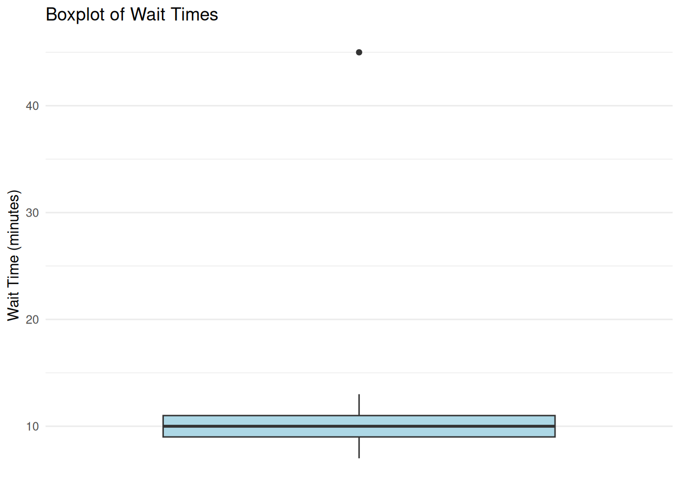
We examine a small dataset of customer wait times (n = 20) and check for outliers. Figure 7.1 shows the distribution visually, while Table 7.2 records which case is flagged by the IQR and z-score rules.
:::: {.content-visible when-format="html"}
::::: {.panel-tabset group="part-b-data-collection-chapter-11-data-screening-and-diagnostic-checks-cell-2"}
#### Rendered Output
```{r}
#| label: part-b-chunk-10-html
#| fig-cap: "Figure 7.1: Customer wait-time boxplot with a potential outlier."
#| alt: "Customer wait-time boxplot with a potential outlier."
#| echo: false
set.seed(2025)
# Simulated wait times (most between 5–15 minutes, one outlier at 45)
wait_times <- c(7, 9, 8, 11, 10, 12, 8, 9, 10, 11, 13, 9, 10, 12, 8, 11, 10, 9, 45, 10)
# Create the data frame
wait_data <- tibble(observation = 1:20, wait_time = wait_times)
# Boxplot
print(
ggplot(wait_data, aes(x = "", y = wait_time)) +
geom_boxplot(fill = "lightblue") +
labs(title = "Boxplot of Wait Times", x = NULL, y = "Wait Time (minutes)") +
theme_minimal() +
theme(
axis.text.x = element_blank(),
axis.ticks.x = element_blank(),
panel.grid.major.x = element_blank(),
panel.grid.minor.x = element_blank()
)
)
# Identify outliers using 1.5*IQR rule
Q1 <- quantile(wait_times, 0.25)
Q3 <- quantile(wait_times, 0.75)
IQR_val <- IQR(wait_times)
lower_fence <- Q1 - 1.5 * IQR_val
upper_fence <- Q3 + 1.5 * IQR_val
# Z-scores for outlier identification
wait_data <- wait_data %>%
dplyr::mutate(z_score = (wait_time - mean(wait_time)) / sd(wait_time))
flagged_cases <- wait_data %>%
dplyr::mutate(
`Z score` = round(z_score, 2),
`IQR flag` = if_else(wait_time < lower_fence | wait_time > upper_fence, "Yes", "No"),
`|z| > 3` = if_else(abs(z_score) > 3, "Yes", "No")
) %>%
dplyr::filter(`IQR flag` == "Yes" | `|z| > 3` == "Yes") %>%
dplyr::transmute(
Observation = observation,
`Wait time` = wait_time,
`Z score`,
`IQR flag`,
`|z| > 3`
)
smallsamplelab_apa_table(
"7.2",
"Outlier flags for the customer wait-time example",
flagged_cases,
note = "The same case is flagged by both the 1.5 × IQR rule and the absolute z-score criterion greater than 3.",
align = c("r", "r", "r", "c", "c")
)
```
#### Cell Code
```{webr-r}
#| context: interactive
#| label: part-b-chunk-10
#| fig-cap: "Figure 7.1: Customer wait-time boxplot with a potential outlier."
library(dplyr)
library(ggplot2)
library(purrr)
library(tibble)
library(tidyr)
set.seed(2025)
# Simulated wait times (most between 5–15 minutes, one outlier at 45)
wait_times <- c(7, 9, 8, 11, 10, 12, 8, 9, 10, 11, 13, 9, 10, 12, 8, 11, 10, 9, 45, 10)
# Create the data frame
wait_data <- tibble(observation = 1:20, wait_time = wait_times)
# Boxplot
print(
ggplot(wait_data, aes(x = "", y = wait_time)) +
geom_boxplot(fill = "lightblue") +
labs(title = "Boxplot of Wait Times", x = NULL, y = "Wait Time (minutes)") +
theme_minimal() +
theme(
axis.text.x = element_blank(),
axis.ticks.x = element_blank(),
panel.grid.major.x = element_blank(),
panel.grid.minor.x = element_blank()
)
)
# Identify outliers using 1.5*IQR rule
Q1 <- quantile(wait_times, 0.25)
Q3 <- quantile(wait_times, 0.75)
IQR_val <- IQR(wait_times)
lower_fence <- Q1 - 1.5 * IQR_val
upper_fence <- Q3 + 1.5 * IQR_val
# Z-scores for outlier identification
wait_data <- wait_data %>%
dplyr::mutate(z_score = (wait_time - mean(wait_time)) / sd(wait_time))
flagged_cases <- wait_data %>%
dplyr::mutate(
`Z score` = round(z_score, 2),
`IQR flag` = if_else(wait_time < lower_fence | wait_time > upper_fence, "Yes", "No"),
`|z| > 3` = if_else(abs(z_score) > 3, "Yes", "No")
) %>%
dplyr::filter(`IQR flag` == "Yes" | `|z| > 3` == "Yes") %>%
dplyr::transmute(
Observation = observation,
`Wait time` = wait_time,
`Z score`,
`IQR flag`,
`|z| > 3`
)
smallsamplelab_apa_table(
"7.2",
"Outlier flags for the customer wait-time example",
flagged_cases,
note = "The same case is flagged by both the 1.5 × IQR rule and the absolute z-score criterion greater than 3.",
align = c("r", "r", "r", "c", "c")
)
```
:::::
::::
:::: {.content-visible unless-format="html"}
```{r}
#| label: part-b-chunk-10
#| fig-cap: "Figure 7.1: Customer wait-time boxplot with a potential outlier."
#| alt: "Customer wait-time boxplot with a potential outlier."
library(tidyverse)
set.seed(2025)
# Simulated wait times (most between 5–15 minutes, one outlier at 45)
wait_times <- c(7, 9, 8, 11, 10, 12, 8, 9, 10, 11, 13, 9, 10, 12, 8, 11, 10, 9, 45, 10)
# Create the data frame
wait_data <- tibble(observation = 1:20, wait_time = wait_times)
# Boxplot
print(
ggplot(wait_data, aes(x = "", y = wait_time)) +
geom_boxplot(fill = "lightblue") +
labs(title = "Boxplot of Wait Times", x = NULL, y = "Wait Time (minutes)") +
theme_minimal() +
theme(
axis.text.x = element_blank(),
axis.ticks.x = element_blank(),
panel.grid.major.x = element_blank(),
panel.grid.minor.x = element_blank()
)
)
# Identify outliers using 1.5*IQR rule
Q1 <- quantile(wait_times, 0.25)
Q3 <- quantile(wait_times, 0.75)
IQR_val <- IQR(wait_times)
lower_fence <- Q1 - 1.5 * IQR_val
upper_fence <- Q3 + 1.5 * IQR_val
# Z-scores for outlier identification
wait_data <- wait_data %>%
dplyr::mutate(z_score = (wait_time - mean(wait_time)) / sd(wait_time))
flagged_cases <- wait_data %>%
dplyr::mutate(
`Z score` = round(z_score, 2),
`IQR flag` = if_else(wait_time < lower_fence | wait_time > upper_fence, "Yes", "No"),
`|z| > 3` = if_else(abs(z_score) > 3, "Yes", "No")
) %>%
dplyr::filter(`IQR flag` == "Yes" | `|z| > 3` == "Yes") %>%
dplyr::transmute(
Observation = observation,
`Wait time` = wait_time,
`Z score`,
`IQR flag`,
`|z| > 3`
)
smallsamplelab_apa_table(
"7.2",
"Outlier flags for the customer wait-time example",
flagged_cases,
note = "The same case is flagged by both the 1.5 × IQR rule and the absolute z-score criterion greater than 3.",
align = c("r", "r", "r", "c", "c")
)
```
::::
Interpretation: Figure 7.1 visually flags observation 19 (wait time = 45 minutes), and Table 7.2 confirms that the same case is identified by both the IQR-based rule and the z-score criterion. Before removing it, investigate whether it reflects a data entry error or a genuine but unusual event. If it is genuine, a defensible alternative is to report results with and without the case or use robust methods that are less sensitive to extremes.
### Checking Normality
Many parametric tests assume normally distributed data (or residuals). With small samples, normality is hard to verify formally. Visual checks (histograms, Q-Q plots) are more informative than statistical tests (Shapiro-Wilk), which have low power with small n. A non-significant Shapiro-Wilk result (p > 0.05) with n < 30 does not confirm normality; it may simply reflect insufficient power to detect departures. Conversely, a significant result warrants visual inspection to judge practical severity.
If data are clearly skewed or have heavy tails, consider nonparametric methods, transformations such as the log or square root, or robust procedures such as trimmed means and bootstrap intervals. This step is about matching the analysis to the actual shape of the data rather than conforming the data to parametric assumptions.
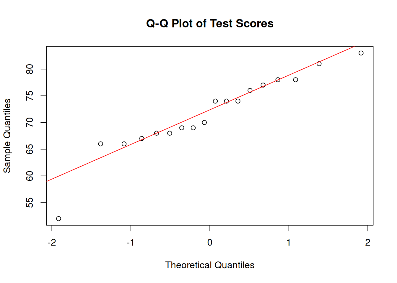
### Example: Q-Q Plot for Normality Assessment
We check whether a small sample of test scores (n = 18) is approximately normally distributed. Figure 7.2 provides the visual diagnostic, and Table 7.3 reports the Shapiro-Wilk statistics in the same rounding format used in the text.
:::: {.content-visible when-format="html"}
::::: {.panel-tabset group="part-b-data-collection-chapter-11-data-screening-and-diagnostic-checks-cell-3"}
#### Rendered Output
```{r}
#| label: part-b-chunk-11-html
#| fig-cap: "Figure 7.2: Q-Q plot of test scores."
#| alt: "Q-Q plot of test scores."
#| echo: false
set.seed(2025)
# Simulated test scores (approximately normal)
test_scores <- round(rnorm(18, mean = 70, sd = 10))
# Q-Q plot
qqnorm(test_scores, main = "Q-Q Plot of Test Scores")
qqline(test_scores, col = "red")
# Shapiro-Wilk test
shapiro_result <- shapiro.test(test_scores)
shapiro_display <- tibble(
Test = "Shapiro-Wilk",
W = formatC(unname(shapiro_result$statistic), format = "f", digits = 4),
`p value` = formatC(shapiro_result$p.value, format = "f", digits = 4)
)
smallsamplelab_apa_table(
"7.3",
"Normality test results for the simulated test-score sample",
shapiro_display,
note = "The p-value is shown to four decimals so the table matches the printed test output exactly.",
align = c("l", "r", "r")
)
```
#### Cell Code
```{webr-r}
#| context: interactive
#| label: part-b-chunk-11
#| fig-cap: "Figure 7.2: Q-Q plot of test scores."
library(dplyr)
library(ggplot2)
library(purrr)
library(tibble)
library(tidyr)
set.seed(2025)
# Simulated test scores (approximately normal)
test_scores <- round(rnorm(18, mean = 70, sd = 10))
# Q-Q plot
qqnorm(test_scores, main = "Q-Q Plot of Test Scores")
qqline(test_scores, col = "red")
# Shapiro-Wilk test
shapiro_result <- shapiro.test(test_scores)
shapiro_display <- tibble(
Test = "Shapiro-Wilk",
W = formatC(unname(shapiro_result$statistic), format = "f", digits = 4),
`p value` = formatC(shapiro_result$p.value, format = "f", digits = 4)
)
smallsamplelab_apa_table(
"7.3",
"Normality test results for the simulated test-score sample",
shapiro_display,
note = "The p-value is shown to four decimals so the table matches the printed test output exactly.",
align = c("l", "r", "r")
)
```
:::::
::::
:::: {.content-visible unless-format="html"}
```{r}
#| label: part-b-chunk-11
#| fig-cap: "Figure 7.2: Q-Q plot of test scores."
#| alt: "Q-Q plot of test scores."
library(tidyverse)
set.seed(2025)
# Simulated test scores (approximately normal)
test_scores <- round(rnorm(18, mean = 70, sd = 10))
# Q-Q plot
qqnorm(test_scores, main = "Q-Q Plot of Test Scores")
qqline(test_scores, col = "red")
# Shapiro-Wilk test
shapiro_result <- shapiro.test(test_scores)
shapiro_display <- tibble(
Test = "Shapiro-Wilk",
W = formatC(unname(shapiro_result$statistic), format = "f", digits = 4),
`p value` = formatC(shapiro_result$p.value, format = "f", digits = 4)
)
smallsamplelab_apa_table(
"7.3",
"Normality test results for the simulated test-score sample",
shapiro_display,
note = "The p-value is shown to four decimals so the table matches the printed test output exactly.",
align = c("l", "r", "r")
)
```
::::
Interpretation: Figure 7.2 shows whether the points remain close to the diagonal line expected under normality, while Table 7.3 reports the Shapiro-Wilk result in matching precision. Here the p-value does not provide strong evidence against normality, but it does not prove normality. With a small sample, the visual diagnostic remains more informative than the test alone.
### Linearity and Homoscedasticity in Regression
Linear regression assumes a linear relationship between predictors and outcome, and constant variance of residuals (homoscedasticity). Scatterplots of residuals vs. fitted values help assess these assumptions.
In a residuals-versus-fitted plot, linearity is supported when residuals scatter randomly around zero with no systematic curvature, and homoscedasticity is supported when the vertical spread remains roughly constant. With n about 20, these patterns are inherently noisy; focus on gross violations such as clear funnel shapes or strong curvature rather than subtle deviations.
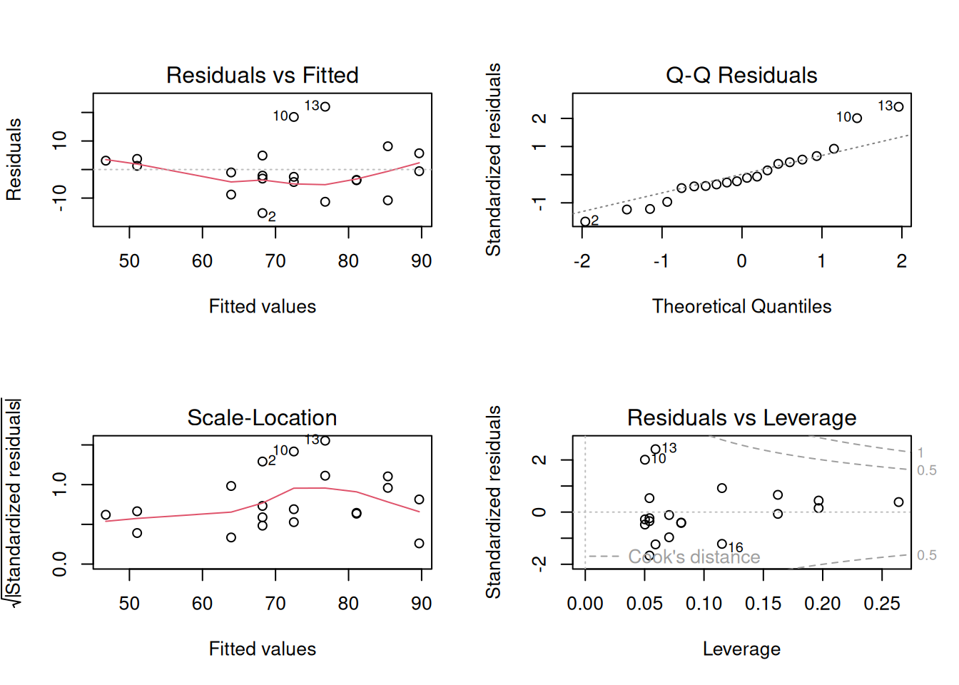
### Example: Regression Diagnostics
We fit a simple linear regression (outcome ~ predictor) with n = 20 and check the standard diagnostic panel. Figure 7.3 summarises the model diagnostics, and Table 7.4 reports the fitted coefficients so the regression example has a formatted numerical counterpart rather than a console dump.
:::: {.content-visible when-format="html"}
::::: {.panel-tabset group="part-b-data-collection-chapter-11-data-screening-and-diagnostic-checks-cell-4"}
#### Rendered Output
```{r}
#| label: part-b-chunk-12-html
#| fig-cap: "Figure 7.3: Standard regression diagnostic plots for the study-hours and exam-score data (n = 20)."
#| alt: "Standard regression diagnostic plots for the study-hours and exam-score data (n = 20)."
#| echo: false
set.seed(2025)
# Simulated study-hours / exam-score data (n = 20)
reg_data <- tibble(
study_hours = round(runif(20, 1, 12)),
exam_score = 40 + 4.5 * study_hours + rnorm(20, 0, 8)
)
# Fit linear model
model <- lm(exam_score ~ study_hours, data = reg_data)
# Diagnostic plots
par(mfrow = c(2, 2))
plot(model)
par(mfrow = c(1, 1))
coef_display <- summary(model)$coefficients %>%
as.data.frame() %>%
tibble::rownames_to_column("Term") %>%
transmute(
Term,
Estimate = formatC(Estimate, format = "f", digits = 3),
`Std. error` = formatC(`Std. Error`, format = "f", digits = 3),
`t value` = formatC(`t value`, format = "f", digits = 2),
`p value` = formatC(`Pr(>|t|)`, format = "f", digits = 3)
)
smallsamplelab_apa_table(
"7.4",
"Regression coefficients for the simulated diagnostic example",
coef_display,
note = sprintf(
"The fitted model explains %.1f%% of the variance in the outcome (adjusted R<sup>2</sup> = %.3f).",
100 * summary(model)$adj.r.squared,
summary(model)$adj.r.squared
),
align = c("l", "r", "r", "r", "r")
)
```
#### Cell Code
```{webr-r}
#| context: interactive
#| label: part-b-chunk-12
#| fig-cap: "Figure 7.3: Standard regression diagnostic plots for the study-hours and exam-score data (n = 20)."
library(dplyr)
library(ggplot2)
library(purrr)
library(tibble)
library(tidyr)
set.seed(2025)
# Simulated study-hours / exam-score data (n = 20)
reg_data <- tibble(
study_hours = round(runif(20, 1, 12)),
exam_score = 40 + 4.5 * study_hours + rnorm(20, 0, 8)
)
# Fit linear model
model <- lm(exam_score ~ study_hours, data = reg_data)
# Diagnostic plots
par(mfrow = c(2, 2))
plot(model)
par(mfrow = c(1, 1))
coef_display <- summary(model)$coefficients %>%
as.data.frame() %>%
tibble::rownames_to_column("Term") %>%
transmute(
Term,
Estimate = formatC(Estimate, format = "f", digits = 3),
`Std. error` = formatC(`Std. Error`, format = "f", digits = 3),
`t value` = formatC(`t value`, format = "f", digits = 2),
`p value` = formatC(`Pr(>|t|)`, format = "f", digits = 3)
)
smallsamplelab_apa_table(
"7.4",
"Regression coefficients for the simulated diagnostic example",
coef_display,
note = sprintf(
"The fitted model explains %.1f%% of the variance in the outcome (adjusted R<sup>2</sup> = %.3f).",
100 * summary(model)$adj.r.squared,
summary(model)$adj.r.squared
),
align = c("l", "r", "r", "r", "r")
)
```
:::::
::::
:::: {.content-visible unless-format="html"}
```{r}
#| label: part-b-chunk-12
#| fig-cap: "Figure 7.3: Standard regression diagnostic plots for the study-hours and exam-score data (n = 20)."
#| alt: "Standard regression diagnostic plots for the study-hours and exam-score data (n = 20)."
library(tidyverse)
set.seed(2025)
# Simulated study-hours / exam-score data (n = 20)
reg_data <- tibble(
study_hours = round(runif(20, 1, 12)),
exam_score = 40 + 4.5 * study_hours + rnorm(20, 0, 8)
)
# Fit linear model
model <- lm(exam_score ~ study_hours, data = reg_data)
# Diagnostic plots
par(mfrow = c(2, 2))
plot(model)
par(mfrow = c(1, 1))
coef_display <- summary(model)$coefficients %>%
as.data.frame() %>%
tibble::rownames_to_column("Term") %>%
transmute(
Term,
Estimate = formatC(Estimate, format = "f", digits = 3),
`Std. error` = formatC(`Std. Error`, format = "f", digits = 3),
`t value` = formatC(`t value`, format = "f", digits = 2),
`p value` = formatC(`Pr(>|t|)`, format = "f", digits = 3)
)
smallsamplelab_apa_table(
"7.4",
"Regression coefficients for the simulated diagnostic example",
coef_display,
note = sprintf(
"The fitted model explains %.1f%% of the variance in the outcome (adjusted R^2 = %.3f).",
100 * summary(model)$adj.r.squared,
summary(model)$adj.r.squared
),
align = c("l", "r", "r", "r", "r")
)
```
::::
Interpretation: Figure 7.3 brings the standard diagnostics together in one place: the residuals-versus-fitted panel checks linearity, the residual Q-Q plot checks normality of errors, the scale-location panel checks homoscedasticity, and the leverage panel highlights influential cases. Table 7.4 gives the corresponding coefficient estimates, but with small samples a single influential observation can still dominate the fitted line, so sensitivity analysis remains important.
### Multicollinearity, Leverage, and Heteroscedasticity
Regression diagnostics in small samples should distinguish three related problems. Multicollinearity means predictors carry overlapping information, which inflates standard errors and makes individual coefficients unstable. Leverage describes how unusual an observation is in the predictor space. Influence describes how much the fitted coefficients would change if that observation were removed. A case can have high leverage but little influence if it lies close to the fitted regression surface; Cook's distance combines leverage and residual size to flag cases that deserve closer inspection.
Variance inflation factors (VIFs) are a practical first screen for multicollinearity. Values above about 5 warrant inspection, and values above about 10 usually indicate that separate coefficient interpretation is fragile. The condition number gives a whole-model summary of near-linear dependency among predictors; values above about 30 are often treated as a warning sign. These cutoffs are heuristics, but they are especially important when n is small because there are few observations to stabilise correlated predictors.
```{r}
#| label: ch7-vif-table
#| echo: false
#| results: asis
set.seed(2025)
vif_data <- tibble(
study_hours = rnorm(24, mean = 6, sd = 1.4),
practice_score = 60 + 6 * study_hours + rnorm(24, mean = 0, sd = 4),
fatigue = rnorm(24, mean = 3, sd = 0.8)
) %>%
mutate(
test_score = 42 + 2.2 * study_hours + 0.25 * practice_score - 1.6 * fatigue +
rnorm(24, mean = 0, sd = 5)
)
vif_model <- lm(test_score ~ study_hours + practice_score + fatigue, data = vif_data)
predictor_names <- c("study_hours", "practice_score", "fatigue")
vif_values <- purrr::map_dbl(predictor_names, function(term) {
other_terms <- setdiff(predictor_names, term)
r_squared <- summary(lm(vif_data[[term]] ~ ., data = vif_data[other_terms]))$r.squared
1 / (1 - r_squared)
}) %>%
stats::setNames(predictor_names)
condition_value <- kappa(scale(model.matrix(vif_model)[, -1]), exact = TRUE)
vif_display <- tibble(
Predictor = c("Study hours", "Practice score", "Fatigue", "Model condition number"),
Diagnostic = c(
formatC(vif_values["study_hours"], format = "f", digits = 2),
formatC(vif_values["practice_score"], format = "f", digits = 2),
formatC(vif_values["fatigue"], format = "f", digits = 2),
formatC(condition_value, format = "f", digits = 1)
),
Interpretation = c(
"Inspect because it overlaps strongly with practice score",
"Inspect because it overlaps strongly with study hours",
"No obvious collinearity concern",
"Whole-model screen for near-linear dependency"
)
)
smallsamplelab_apa_table(
"7.5",
"Multicollinearity diagnostics for a small regression example",
vif_display,
note = "VIF values above about 5 warrant inspection and values above about 10 make separate coefficient interpretation fragile. Condition numbers above about 30 are a common whole-model warning sign.",
align = c("l", "r", "l")
)
```
If the residuals-versus-fitted plot shows clear heteroscedasticity, exclusion is usually not the first response. Recheck whether the model is correctly specified, then consider reporting heteroscedasticity-consistent standard errors as a sensitivity check. The `sandwich` and `lmtest` packages provide this workflow:
```{r}
#| eval: false
#| label: ch7-sandwich-template
library(sandwich)
library(lmtest)

lmtest::coeftest(vif_model, vcov. = sandwich::vcovHC(vif_model, type = "HC1"))
```
When reporting these diagnostics, avoid vague wording such as "all assumptions were met." A better statement is specific: "Residual plots showed no clear curvature; vertical spread increased slightly at higher fitted values, so HC1 robust standard errors were also computed. The interpretation of the study-hours coefficient did not change." This tells readers what was checked, what was imperfect, and whether the conclusion depended on the diagnostic judgement.
::: {.callout-note appearance="simple" icon=false}
## Outlier Disposition Decision Box
When a case is flagged by Mahalanobis distance, leverage, or Cook's distance, first check whether it is a data error. If it is, correct it from the source record or exclude it with a clear audit trail. If the value is genuine but extreme, retain it and report a sensitivity analysis with and without the case. If the case belongs to a different population from the one defined in the research question, exclude it only after documenting why it falls outside the target population. Do not remove a case solely because it weakens statistical significance.
:::
### Identifying Data Entry Errors
Data screening should also look for values outside plausible ranges, inconsistent coding schemes, duplicate records, and implausible combinations of attributes. Examples include an age of 150, a Likert response of 8 on a 1–7 scale, one participant ID entered twice, or a primary-school student apparently reporting 20 years of work experience. When any of these appear, cross-check them against source documents or, when appropriate, re-contact participants before deciding whether a correction or exclusion is justified.
### Documenting Data Cleaning
Maintain a data-cleaning script that reads the raw data, flags potential outliers or inconsistencies, applies any corrections or exclusions with explicit justifications, and then produces the cleaned dataset used for analysis. In the write-up, report how many observations were excluded, why they were excluded, and how the summary statistics changed after cleaning so readers can see what decisions mattered. When adapting the code in this chapter, record `set.seed()` values and package versions, for example with `sessionInfo()`, so stochastic diagnostics can be reproduced.
### Key Takeaways
Data screening matters more, not less, when samples are small because a single unusual observation can distort a mean, a correlation, or a regression coefficient. In practice, the most defensible approach combines visual diagnostics, simple numerical rules, and context-specific judgment rather than mechanically deleting anything extreme. Good screening therefore ends with transparent documentation: what was flagged, what was changed, what remained in the dataset, and whether the conclusions were sensitive to those decisions.
### Self-Assessment Quiz
```{r}
#| echo: false
#| results: asis
source(normalizePath(file.path(dirname(knitr::current_input(dir = TRUE)), "..", "R", "quiz_helpers.R"), mustWork = TRUE))
smallsamplelab_render_quiz(list(
list(
prompt = "Why are outliers particularly problematic in small-sample research?",
options = c("They are easier to detect visually", "They can have disproportionate influence on results due to the limited number of observations", "Small samples always have more outliers than large samples", "Outliers are impossible to detect with small samples"),
answer = 2L,
explanation = "Outliers matter more when there are few observations because each case contributes a larger share of the information. A single extreme value in a sample of 15 can drastically shift means, correlations, and regression slopes."
),
list(
prompt = "What is the primary advantage of Mahalanobis distance over univariate outlier detection methods?",
options = c("It is faster to compute", "It measures how far an observation lies from the multivariate centre, accounting for covariances among variables", "It only works with large samples", "It automatically removes all outliers"),
answer = 2L,
explanation = "Mahalanobis distance evaluates how unusual a case is once the variables are considered together rather than one at a time. That matters because a participant can look ordinary on each separate variable but still form an unusual multivariate combination."
),
list(
prompt = "According to Tukey's fences method, an observation is flagged as a potential outlier if it falls:",
options = c("Within 1.5 × IQR from the quartiles", "Beyond ±2 standard deviations from the mean", "Beyond 1.5 × IQR from the quartiles", "Exactly at the median"),
answer = 3L,
explanation = "Tukey's fences flag values below Q1 - 1.5×IQR or above Q3 + 1.5×IQR. These are screening flags, not automatic deletion rules."
),
list(
prompt = "Why are visual diagnostics (Q-Q plots, boxplots) preferred over formal normality tests (Shapiro–Wilk) for small samples?",
options = c("Visual diagnostics are more statistically rigorous", "Normality tests have low power with small samples and may not detect departures; visual checks provide more insight", "Normality tests are too expensive", "Visual diagnostics automatically calculate p-values"),
answer = 2L,
explanation = "With only a small number of observations, formal normality tests often have too little power to detect meaningful departures from the model. A Q-Q plot or boxplot lets the analyst see skewness, heavy tails, and unusual points directly instead of relying on a single p-value."
),
list(
prompt = "In a regression diagnostic plot of \"Residuals vs Fitted Values,\" what does a funnel-shaped pattern indicate?",
options = c("Perfect homoscedasticity", "Heteroscedasticity—residual variance changes with fitted values", "Normality of residuals", "High collinearity among predictors"),
answer = 2L,
explanation = "A funnel shape indicates that residual spread changes across the fitted-value range. That pattern violates the constant-variance assumption."
),
list(
prompt = "What does Cook's distance measure in regression diagnostics?",
options = c("The distance between two data points", "The influence of each observation on the regression coefficients; high values indicate influential observations", "The correlation between predictors", "The degree of multicollinearity"),
answer = 2L,
explanation = "Cook's distance measures how much the fitted regression coefficients would change if a case were removed. High values identify observations that deserve sensitivity checks."
),
list(
prompt = "When should an outlier be removed from analysis?",
options = c("Always, because outliers are bad", "Never, because all data points are valuable", "Only if there is clear evidence of data entry error or the observation does not belong to the target population", "Whenever it makes the results statistically significant"),
answer = 3L,
explanation = "Removal is justified only when the case is a data error or falls outside the target population. Otherwise, document the case and report sensitivity analyses when it materially affects results."
),
list(
prompt = "What is an example of a data entry error that should be flagged during data screening?",
options = c("A participant with a high test score", "A Likert response of 8 on a 1–7 scale", "A missing value in a survey", "A participant who completed all questions"),
answer = 2L,
explanation = "A response of 8 on a 1-7 scale is outside the instrument's valid range. That value should be checked against the source record before analysis."
),
list(
prompt = "Why is documenting data cleaning decisions in a reproducible script important?",
options = c("It allows others to verify exclusions and understand how the cleaned dataset was produced", "It makes the analysis run faster", "It is required by all statistical software", "It prevents missing data from occurring"),
answer = 1L,
explanation = "A reproducible cleaning script lets readers verify which cases were flagged, corrected, excluded, or retained. That transparency is essential when each small-sample decision can change the result."
),
list(
prompt = "In a Q-Q plot, if the points deviate substantially from the diagonal line at the tails, what does this suggest?",
options = c("The data are perfectly normally distributed", "The data may have skewness or heavy tails", "The sample size is too large", "There are no outliers present"),
answer = 2L,
explanation = "Tail departures from the diagonal suggest skewness or heavier or lighter tails than expected under normality."
)
))
```