
Sentiment plot: diverging bar, or a positive/negative comparison cloud
Source:R/plots.R
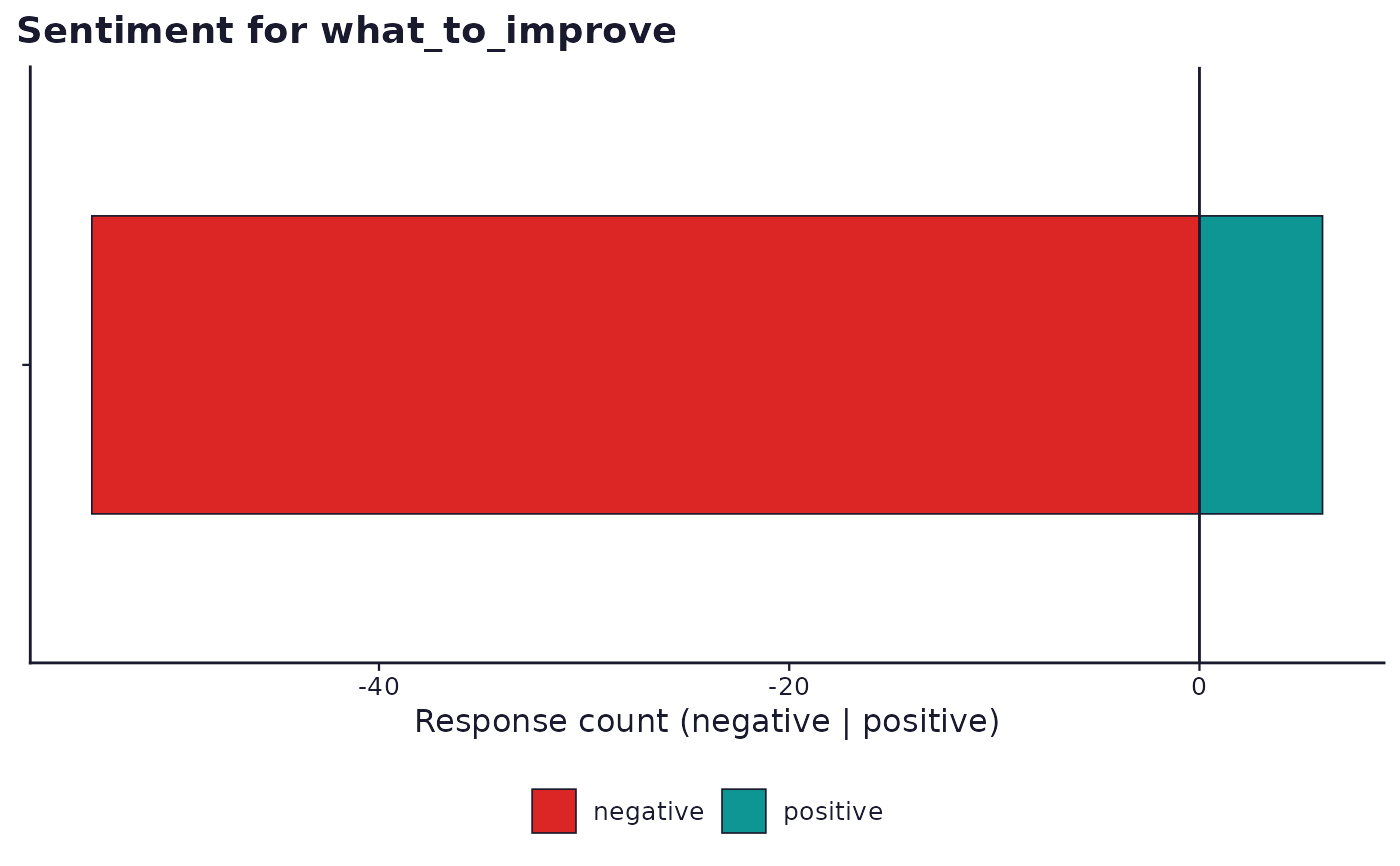
sframe_plot_sentiment.RdA ggplot2 diverging bar for a tidy_sentiment result by default:
positive counts extend one direction, negative counts the other, so bar
position (not colour alone) carries the primary polarity signal, the
same convention sframe_draw_likert_diverging() uses for Likert
agreement (dark ramp toward the pole) rebuilt here in ggplot2 rather
than called directly, since that helper is base-graphics and
Likert-scale-specific. Facets by group when result$table carries a
group column, mirroring sframe_plot_term_frequency()'s grouped
branch.
Usage
sframe_plot_sentiment(result, palette = c("web", "print"))Arguments
- result
A
tidy_sentimentresult list fromrun_analysis_plan().- palette
One of
"web"or"print". Seesframe_brand().
Details
When result$options$wordcloud is TRUE (opt-in, default FALSE,
matching sframe_plot_term_frequency()'s own word-cloud toggle),
draws a comparison cloud instead: negative-sentiment words above the
centre line, positive-sentiment words below it, each word sized by how
often it occurred, using the internal tidy_sentiment runner's
$word_sentiment word-by-sentiment counts. Answers a different
question from the diverging bar: not "how many responses leaned
positive," but "which words drove that."
Examples
# \donttest{
if (requireNamespace("ggplot2", quietly = TRUE) &&
requireNamespace("tidytext", quietly = TRUE)) {
demo <- sframe_demo("open_text")
res <- run_analysis_plan(demo$responses, demo$instrument)
sframe_plot_sentiment(res$RQ7)
}
#> Warning: K=2 is equivalent to a unidimensional scaling model which you may prefer.
 # }
# }