
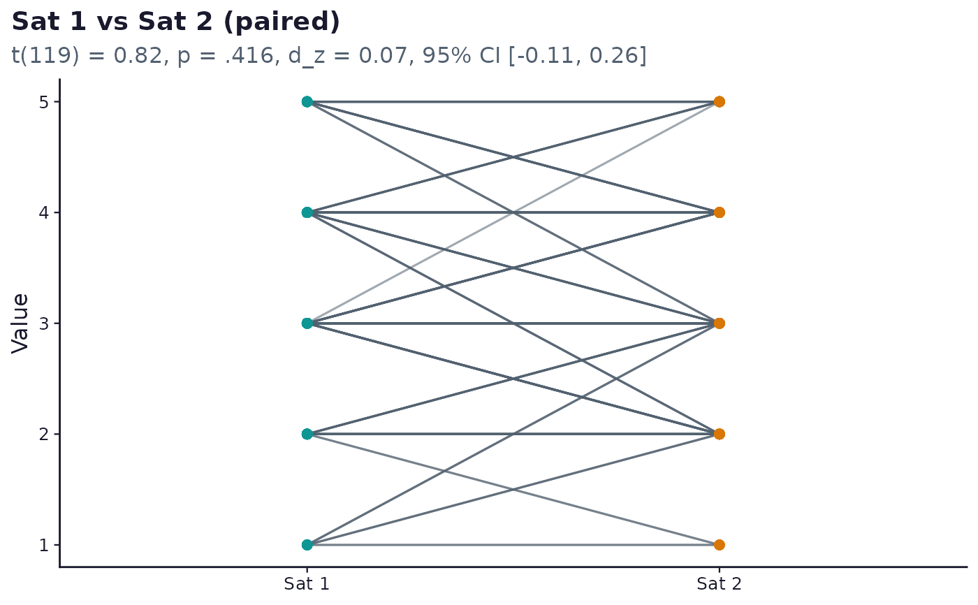
One line per respondent connecting their two paired values, shared by
t_test_pair and wilcoxon_pair (both carry vars = c(x_column, y_column) on the same respondents). The standard visual for a paired
design: it shows the direction and consistency of individual change,
which a plain bar-of-means would hide.
Usage
sframe_plot_paired_comparison(result, data, palette = c("web", "print"))Examples
# \donttest{
if (requireNamespace("ggplot2", quietly = TRUE)) {
demo <- sframe_demo_data()
res <- run_analysis_plan(demo$responses, demo$instrument)
sframe_plot_paired_comparison(res$rq_ttest_pair, demo$responses)
}
 # }
# }