
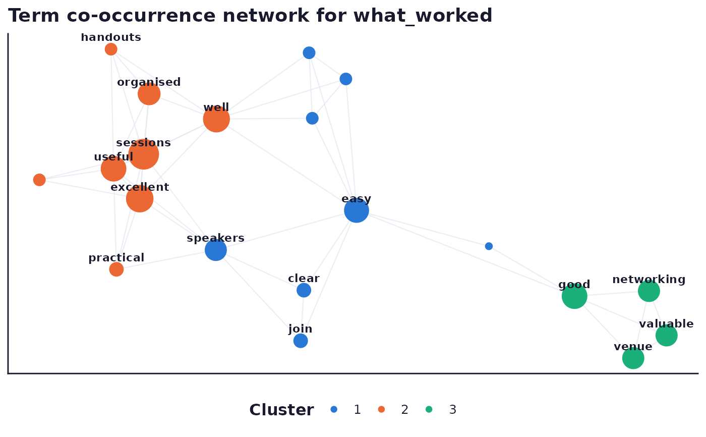
Plots a co_occurrence_network result's node table (term, frequency,
cluster, x, y) as a network diagram: edges (from result$edges) as
line segments underneath, nodes as points sized by term frequency and
coloured by Louvain cluster, with term labels on the larger points only.
Labelling every point on a dense network risks overlap chaos, so only
the top 15 nodes by frequency are labelled; the full term list stays
available in result$table.
Usage
sframe_plot_cooccurrence_network(result, palette = c("web", "print"))Arguments
- result
A
co_occurrence_networkresult list fromrun_analysis_plan(), carryingtableandedges.- palette
One of
"web"or"print". Seesframe_brand().
Details
Clusters beyond the first 8 (ranked largest first) are folded into a
single "Other" bucket rather than cycling or interpolating a new hue,
per the dataviz skill's categorical-colour guidance; see
.sframe_cluster_palette().
Examples
# \donttest{
if (requireNamespace("ggplot2", quietly = TRUE) &&
requireNamespace("igraph", quietly = TRUE)) {
demo <- sframe_demo("open_text")
res <- run_analysis_plan(demo$responses, demo$instrument)
sframe_plot_cooccurrence_network(res$RQ6)
}
#> Warning: K=2 is equivalent to a unidimensional scaling model which you may prefer.
 # }
# }